
|
Getting your Trinity Audio player ready...
|
Is your website not very attractive and looking outdated? Wondering what type of design elements you should use to make it more appealing and user-friendly?
A modern website is essential for any business today. It is an ideal platform for marketers to showcase their products or services, reach potential customers, and establish their brand identity. Creating a stunning website that resonates with your target audience can help bring more leads and sales, so it’s important to create an eye-catching one that draws in visitors.
But where do you start if you’ve never designed a website before? There are plenty of online tools that can help novice designers create simple websites but for the best results, it pays to look at some of the many amazing website examples out there.
In this article, we will explore some of the most creative and effective designs used by websites around the world – starting with a few basics that everyone should know.
Online Sales
Online sales are the sale of goods, products, or services through online channels and internet environments.
20 Website Examples and Designs
Having a visually appealing website is essential for attracting potential customers and generating leads.
From crafting the perfect color palette to finding inspiring images and creating an easy-to-navigate user experience, many elements go into designing an effective website.
So let’s take a look at these 20 amazing website examples and designs that you can use to get inspired!
1. Airbnb
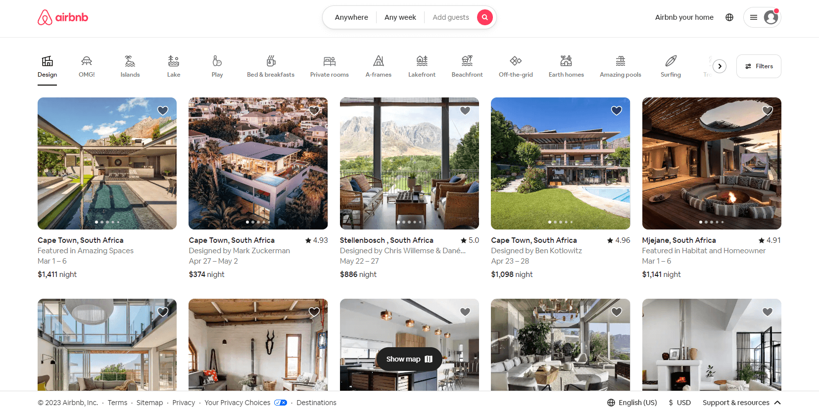
Airbnb is a popular short-term vacation rental company that offers hosts and properties all over the world. Their website design is user-friendly, allowing users to easily navigate the site and quickly find what they need.
The homepage greets users with the destination and date search form, guiding them to the next logical step in their customer journey. Additionally, the navigation bar has eye-catching icons that segment listings into various easy-to-use categories.
To reduce friction when using the site, Airbnb also implemented a smart search form that auto-fills their last search. Finally, visually stunning graphics of rentals all over the world are displayed on their homepage to create urgency and inspire customers to book an Airbnb and start traveling.
2. Traackr
Traackr is an influencer marketing platform that helps brands find the right influencers to promote their products. With a visually engaging website featuring eye-pleasing colors, blocks of staggered images, and scroll-triggered animations, Traackr creates a pleasant user experience for its customers.
Its success is evident through case studies and testimonials from clients who have experienced real results from the services provided by this platform. Traackr works with sales teams, marketing teams, revops teams, customer service teams, and revenue growth to create a single source of truth for the entire company to achieve common goals while maximizing revenue potential.
The revops strategy helps track critical metrics such as customer satisfaction and customer lifetime value to increase predictable revenue and reach revenue goals.
3. Dropbox
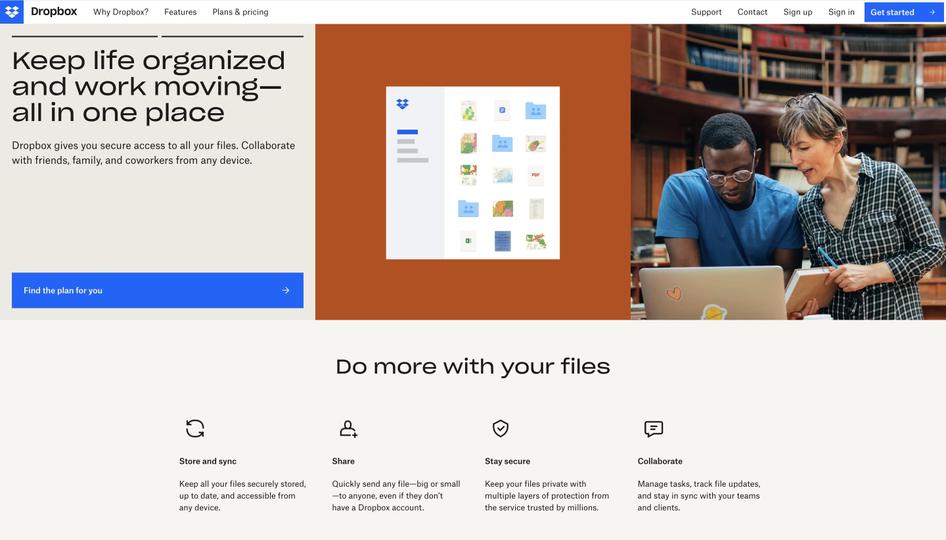
Dropbox is a file hosting service that offers cloud storage, file synchronization, and client software. The company’s homepage design features an eye-catching geometrical shape filled with slideshow examples of what users can accomplish with the product.
The catchy subheading ‘Do more with your files’ clearly states what Dropbox helps users achieve. Additionally, Dropbox lists its best features in a bar below the subheading to quickly summarize their value in an easily digestible way.
The powerful homepage design helps users understand the product’s unique selling proposition and guides them on what to do next. From being able to manage projects more efficiently to organizing documents quickly and securely, Dropbox makes it easier for businesses and individuals alike to make full use of their available data.
With its intuitive user experience and no-nonsense approach, Dropbox continues to provide an invaluable service all around the world.
4. Freshbooks
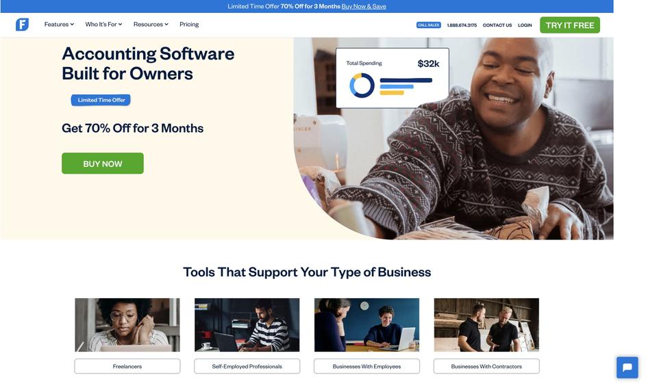
Freshbooks, a cloud-based accounting software company, offers a simple homepage design. Using minimal copy and strategic white space, they’ve used color contrast to their advantage with blue and green CTA buttons that stand out against the beige background.
Their sub-navigation section is well-categorized, with labels like ‘Tools to support your type of business,’ which makes it easy for visitors to find solutions for their use cases. This design is perfect for businesses seeking a simple solution to complex user problems such as SaaS companies.
Freshbooks sets the standard for website designs that prioritize usability and clarity while providing users with the resources needed to succeed.
5. Soundstripe
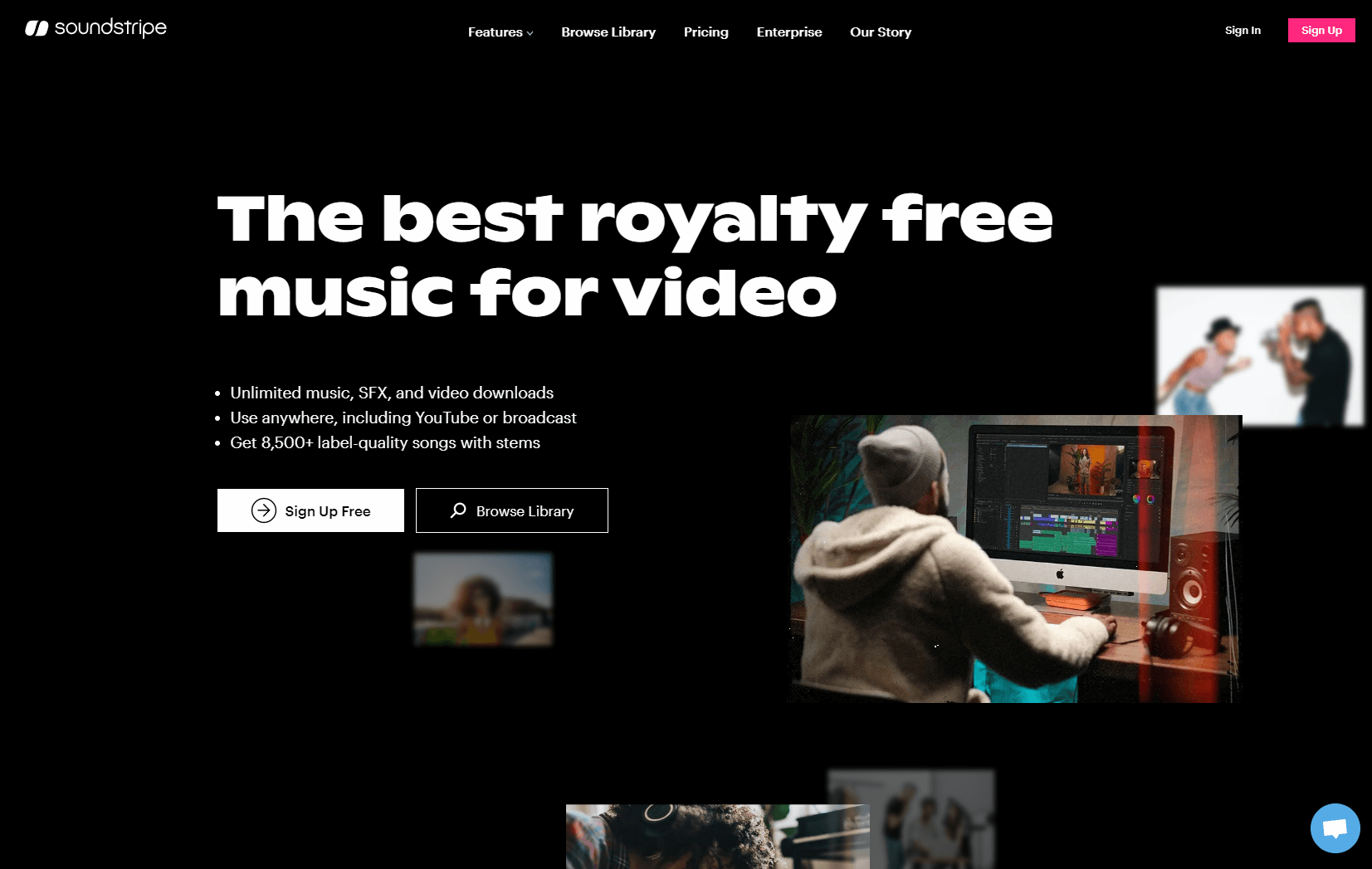
Searching for quality music to license for a video project can be a challenge, but Soundstripe offers an incredible range of well-produced songs and sound effects at an affordable price.
Their homepage entices visitors with three free royalty tracks, and the rest of their website is carefully organized by genre. From modern orchestral to chill hop, there’s something for everyone.
What’s more, Soundstripe has curated playlists so you can easily find what you’re looking for. With Soundstripe, you can get great music quickly and easily without compromising on quality or price.
6. Shopify
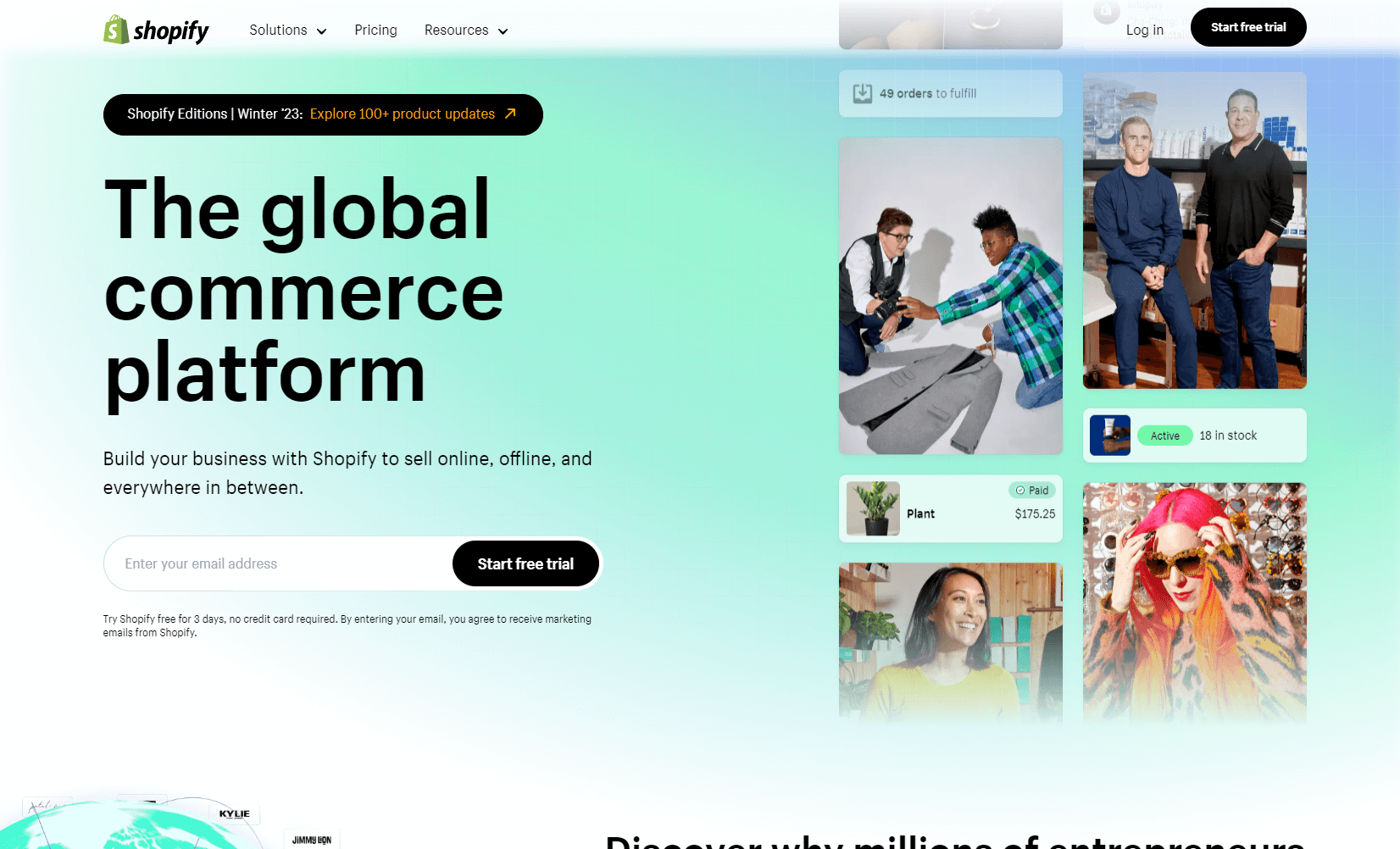
Shopify is a global ecommerce platform that enables users to set up online stores with ease. Shopify’s UX is consistent across all devices, meaning CTAs and illustrations adapt depending on whether users are browsing from their desktop or mobile device.
For example, the main CTA button on personal computers and tablets appears to the right of the form field whereas on smaller mobile displays it sits underneath, making it easier for users to scroll downwards on touchscreen devices.
Additionally, for mobile device users, the email signup field is collapsed into a small icon that can be clicked to expand and drive conversions without cluttering the screen. All in all, Shopify offers an intuitive and user-friendly interface for businesses who are looking to enter the ecommerce market.
7. Colab
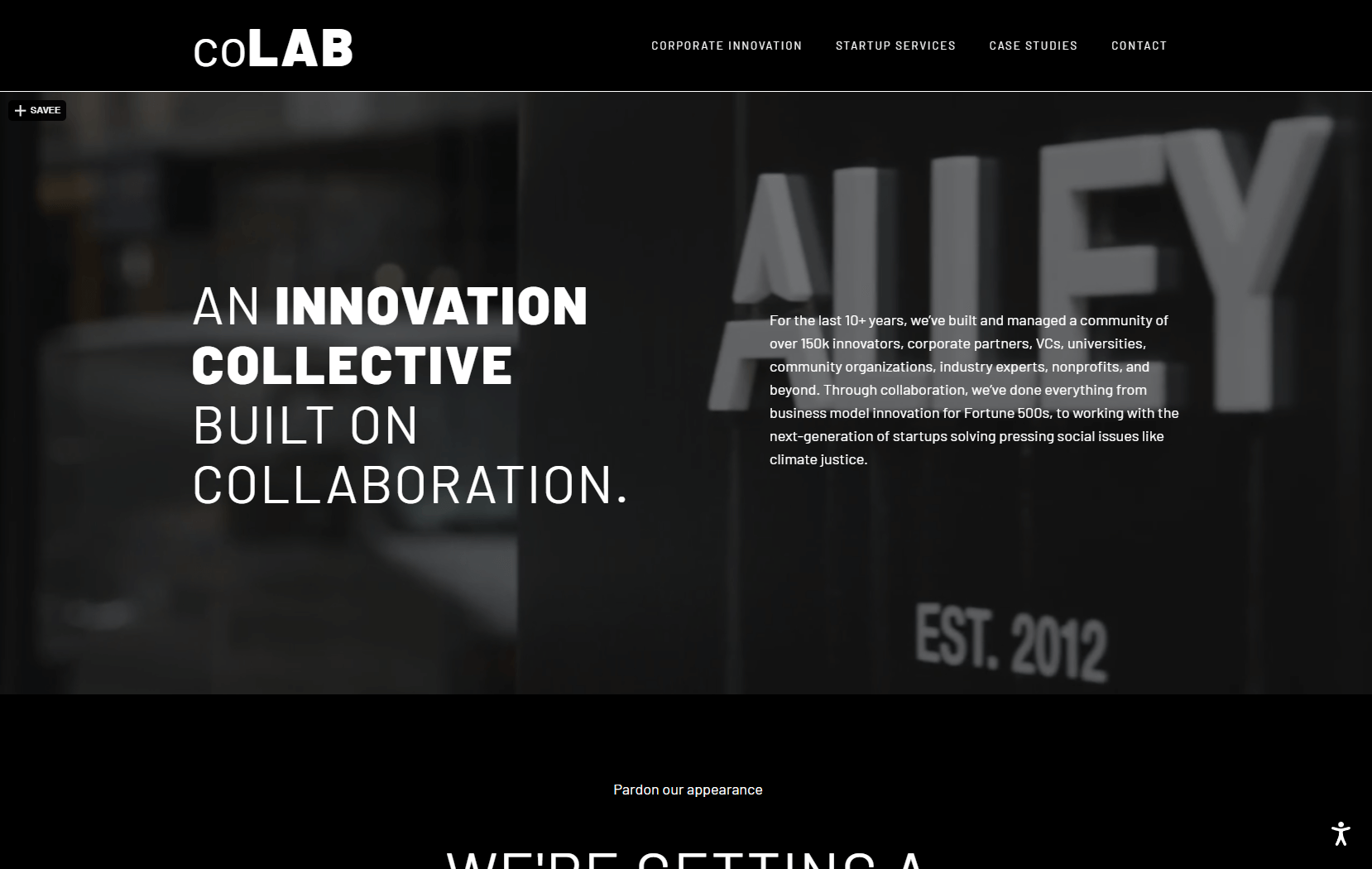
Colab (formerly Alley) is one of the most innovative coworking spaces in the market today. Not only do they offer traditional office furniture, desks, and chairs, but they also provide a unique opportunity for collaboration and community.
Their website design reflects this perfectly with its grid-based layout filled with photos of their vibrant community. This design choice allows Alley to capitalize on their main selling point: that it’s more than just a room – it’s an experience.
With events and opportunities to collaborate, Alley has created a space that brings people together, encourages creativity, and fosters growth within its customer base. From marketing teams to customer service teams, everyone can benefit from Alley’s revops strategy to achieve a common goal: revenue growth.
8. World Financial Group
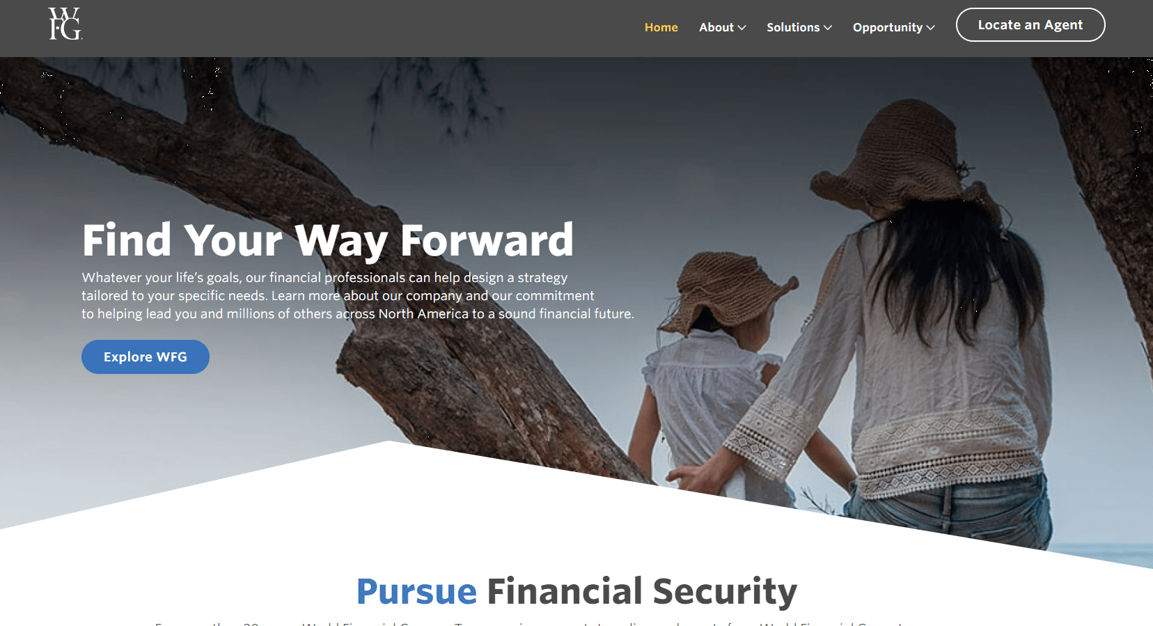
World Financial Group is an organization that has set out to revolutionize the way small businesses build their financial freedom. To achieve this, they have implemented a website that uses stunning design and quality content to communicate their mission in an honest voice.
The website also provides a comprehensive source of truth for customers on topics such as sales teams, revops teams, revenue operations, customer success teams, customer journeys, key metrics, and tech stacks. Furthermore, customers can learn about important concepts such as the sales funnel and customer lifecycle to maximize their revenue potential and set achievable goals.
With World Financial Group’s single source of truth approach, the entire company can benefit from having a unified understanding of customer success and satisfaction throughout the entire customer lifetime.
9. Kraftful
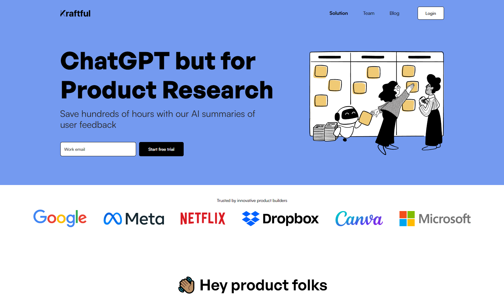
Kraftful is a software solution provider that focuses on creating apps for companies that develop smart devices. Their design is characterized by calculated restraint, with just enough information displayed on the landing page to showcase their services and inspire customers to get in touch.
On their website, key calls to action such as emailing them or scheduling a call are prominently featured at the top and bottom of the page.
For those wanting more information, they offer visuals and supporting text to learn more about topics such as sales team development, revops strategy, customer success, customer journey, key metrics, tech stacks, sales funnel, customer lifecycle, customer lifetime value potential, and revenue goals.
Kraftful allows businesses to focus on hardware while they take care of the software development side of things for an entire company or single source of truth.
10. Mighty
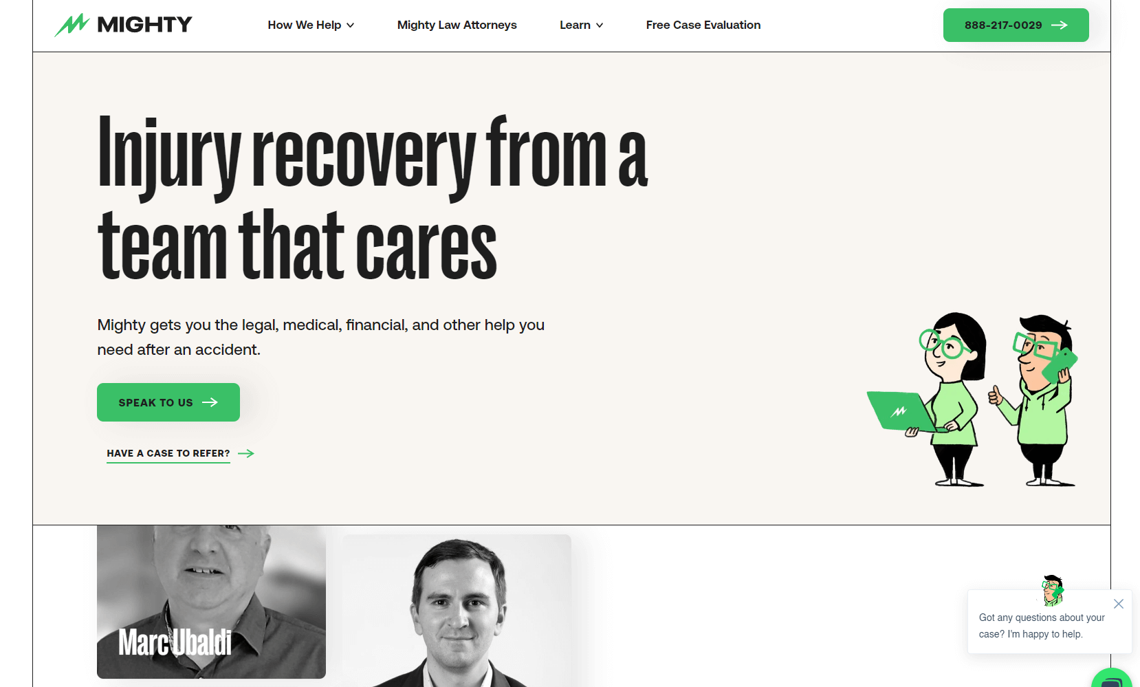
Mighty is a software platform specializing in tracking personal injury liens, providing valuable data for the medical industry. Their website design emphasizes action and features bold headlines, animated icons, and micro-interactions to create an inviting layout.
Additionally, they have a blog with articles that are technical yet easy to understand for non-experts. With their unique approach to customer service, marketing teams, revops teams, revenue operations, and customer success teams can all make use of Mighty’s website to reach common goals of predictive revenue growth and improved customer satisfaction.
It’s clear that Mighty understands its potential audiences and has created an attractive website designed to capture attention and convert visitors into satisfied customers.
11. Nike
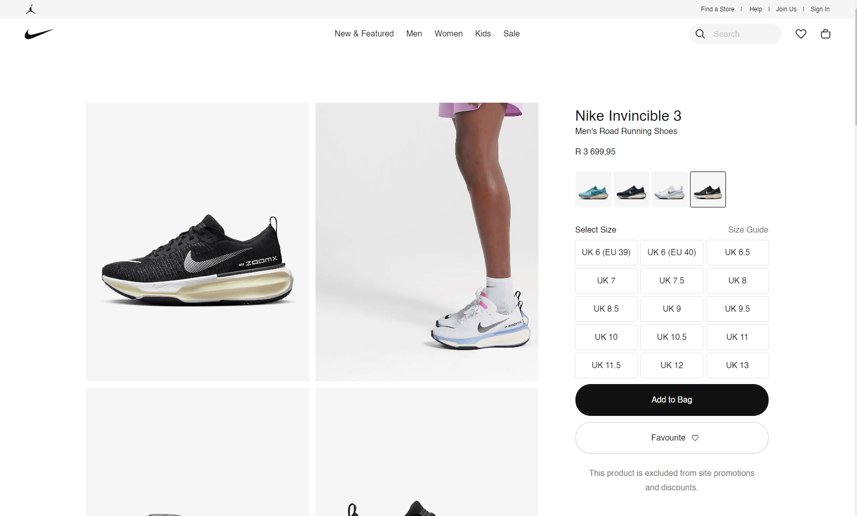
Nike is a global sportswear giant that sells a wide range of products through its ecommerce website. The checkout process on Nike’s website is a great example of how minimalist design and copy can be leveraged to create a streamlined user experience.
The checkout page is designed to be completed in three easy steps without the need for users to log in. Additionally, the page is responsive to user input, displaying a green checkmark when information is entered correctly and providing clear feedback to the user.
To further simplify the process, Nike’s checkout page also auto-fills addresses, making it less likely for users to abandon their carts due to the hassle of entering their details multiple times.
The success of Nike’s checkout page lies in its ability to balance simplicity and efficiency. By focusing on these design principles, Nike ensures that the checkout process is smooth and hassle-free for its customers, leading to higher conversion rates and customer satisfaction.
12. IBM
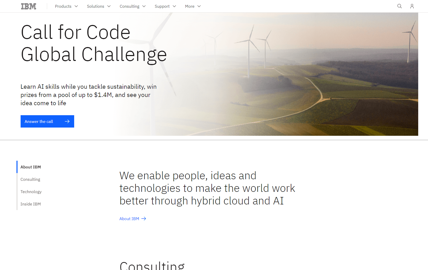
IBM, a multinational technology company, has won accolades for its engaging and immersive website design from Awwwards. The website offers visitors an auditory and visual experience, prompting them to put on headphones to get the full experience. Even without headphones, users are engaged by the responsive background that moves as they navigate through the page.
IBM’s website also uses visual storytelling to make complex tools like AI easily understandable for users. They accomplish this by turning their product vision into an experience. Through video game-like functions, site visitors can explore three user stories and learn more about IBM’s Watson tool.
In addition, the website layout is well-balanced, with a large title that grabs users’ attention and a bold blue call-to-action button. Overall, IBM’s website is a great example of a streamlined site focused on a complex concept.
To emulate their design, it is important to get creative and think of the website as an immersive experience. Look for ways to create user delight through images, audio, and moving graphics.
13. The People Vs Coffee
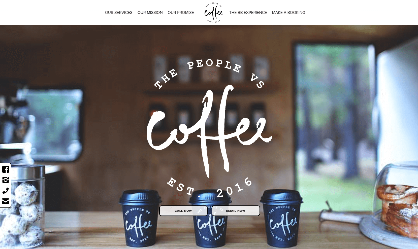
The People Vs Coffee, an Australian pop-up coffee shop, has designed a visually appealing one-page website that captures the essence of their mobile coffee service. The hero image, featuring the interior of their coffee trailer, exudes a neat and orderly vibe while showcasing their dedication to the art of making coffee.
The website features subtle yet impactful animations and effects, including a hover effect at the top that captures the user’s attention, scroll-triggered fade-ins, and a quirky animation of a car hauling the coffee trailer. These design elements add a touch of playfulness to the website, making it more engaging for users.
Furthermore, the website includes a sticky block on the left that features social media links and other ways to get in touch with the company. This is a unique addition as these elements are often overlooked or placed in the website footer. The People Vs Coffee seems to prioritize personal connections with their customers, and this feature provides an immediate opportunity to do so.
Overall, The People Vs Coffee’s website is a great example of a one-page design that effectively captures the brand’s personality and values. It provides a memorable user experience, and its attention to detail helps set it apart from competitors.
14. Circle Website
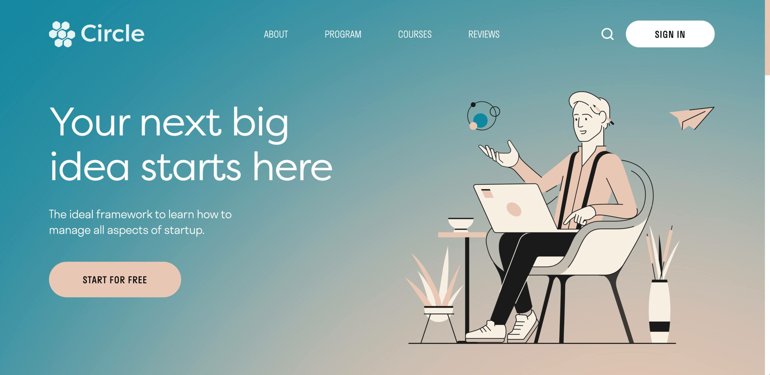
The Circle website template by Halo Lab is a beautiful example of using design elements to showcase the features of a fictional platform. The gradient background and carefully crafted illustrations create a visually appealing experience for visitors. The subtle scroll animations draw attention to important elements, making the site engaging and interactive.
This template is perfect for businesses looking for a website that showcases their platform’s capabilities, course listings, and client testimonials. Whether you’re a SaaS platform or an online course provider, the Circle template can be customized to meet your specific needs.
Cloning this template is a straightforward process that allows you to easily customize it to your brand’s look and feel. You can add your content, images, and branding elements to create a unique and professional website that reflects your business’s personality and values.
15. Fortnight Studio
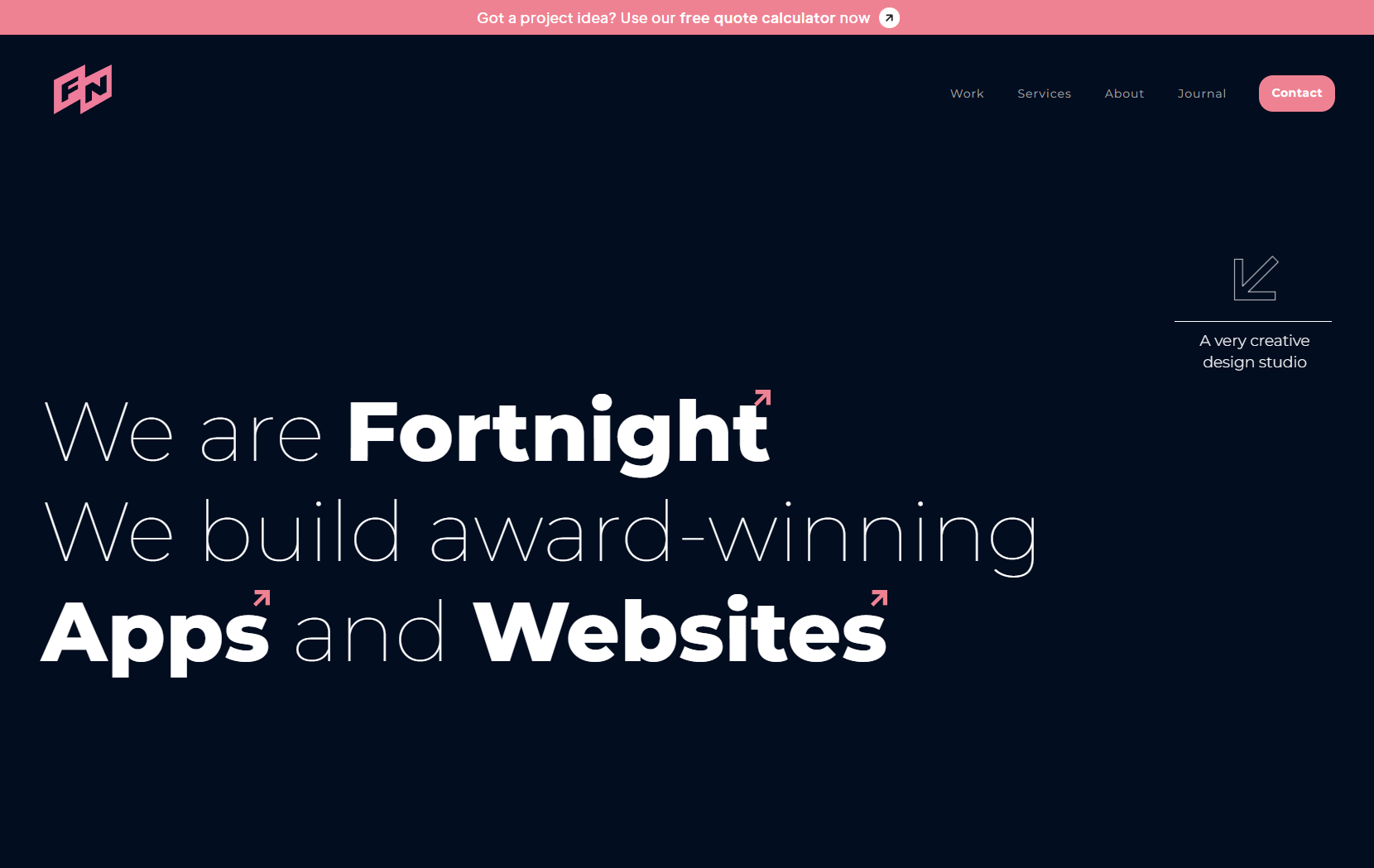
Fortnight Studio is a design and development studio that sets itself apart from other agencies by focusing solely on startups. They intentionally keep their company small to maintain their specialization in serving startup clients. Their website uniquely showcases their work, with a horizontal scrolling gallery of projects and logos of major clients they’ve worked with.
Rather than having an extensive portfolio, Fortnight Studio opts for a more streamlined approach, giving visitors just enough insight into their marketing savvy to inspire a click on their “LET’S CHAT” button. By doing so, they can attract potential clients who are looking for a specialized agency that understands the unique challenges and opportunities of startups.
16. Andre Givenchy
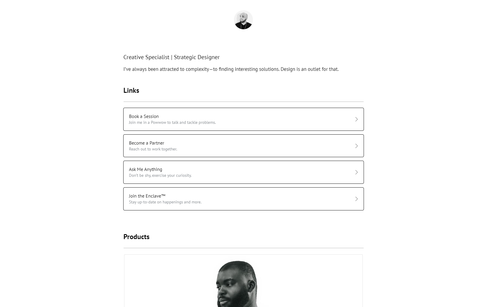
Andre Givenchy’s website stands out for its clear presentation of the value he offers and the passion he brings to each project. The website provides plenty of social proof, which is becoming increasingly important in today’s online environment. Visitors can see the brands Andre has worked with and read testimonials and case studies, giving them a clear idea of his expertise and experience.
Moreover, the website’s design is sleek and modern, with a simple layout that puts the focus on the content. The use of white space makes the text and images stand out, making it easy to navigate and understand.
One of the standout features of the website is the “Approach” section, where Andre outlines his process in detail. This helps potential clients understand how he works and what they can expect when they hire him. The website also includes a blog where Andre shares his thoughts on design and marketing, further demonstrating his expertise and providing value to visitors.
Overall, Andre Givenchy’s website is an excellent example of how to showcase your skills and experience while providing value to potential clients. The combination of social proof, clear messaging, and modern design makes it easy for visitors to understand why Andre is an excellent choice for their design needs.
17. MAKE IT
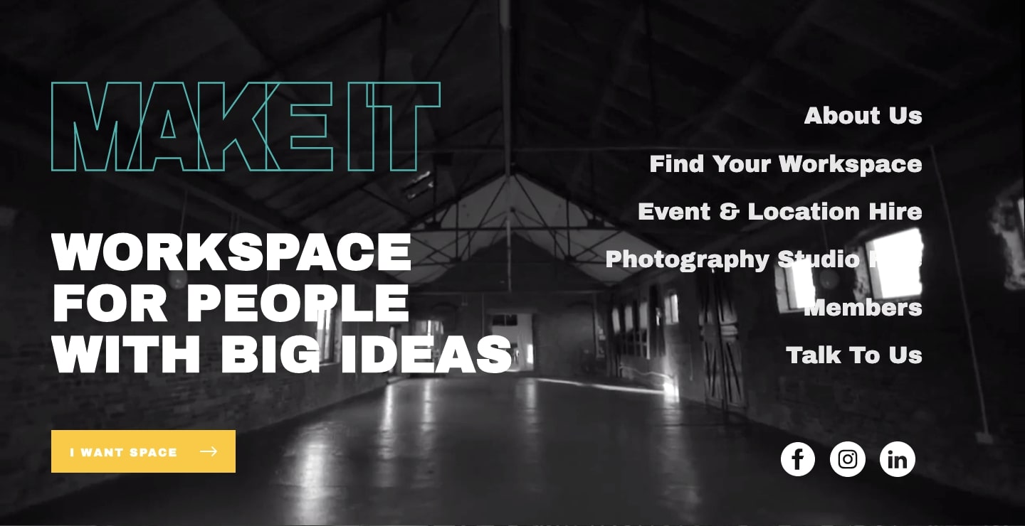
MAKE IT, a creative workspace provider in London stands out with its eye-catching design that uses big, bold typography to make a visual impact. The designer’s typographic wizardry is evident in the use of scroll-triggered effects, and variations in size, weight, and color. As a result, the workspace’s design is transformed into a stunning and dynamic experience.
In addition to its striking use of typography, MAKE IT’s design includes images and hover effects that help showcase important information about their workspaces. Visitors can easily find all the necessary details about available spaces, including the location, facilities, and pricing. The website’s clean layout and intuitive navigation make it easy for visitors to quickly find what they need and book a workspace.
Overall, MAKE IT’s website design is a great example of how a creative workspace provider can stand out in a crowded market. Using bold typography and stunning visuals, the design effectively communicates the brand’s personality and unique experience.
18. Bon Bon Bon
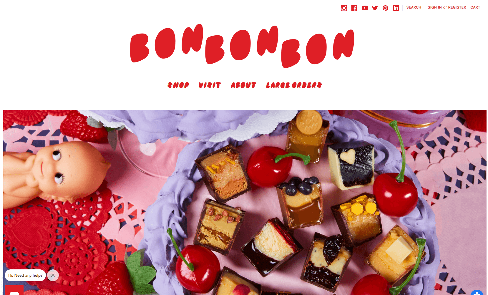
Bon Bon Bon’s website design is a feast for the eyes, with a colorful and playful theme that perfectly reflects the artisan chocolate company’s fun-loving personality. The design is packed with delightful details, from whimsical illustrations to playful animations and quirky patterns.
One of the standout features of the site is the use of bold, vibrant colors. Each section of the site is color-coded, making it easy for users to navigate and find what they’re looking for. The homepage features a playful pattern of circles in various shades of pink, orange, and blue, while the product pages showcase the chocolates against a bright yellow background.
The website also makes clever use of typography, with various fonts and sizes used to create a sense of whimsy and playfulness. The add-to-cart page is a great example of this, with the various options presented in a playful, almost childlike font.
Bon Bon Bon’s website is a great example of how a brand can inject personality and fun into its design, while still creating a functional and user-friendly site. By using bold colors, playful illustrations, and clever typography, the site perfectly captures the essence of the brand and its artisanal chocolates.
19. Kettle & Fire
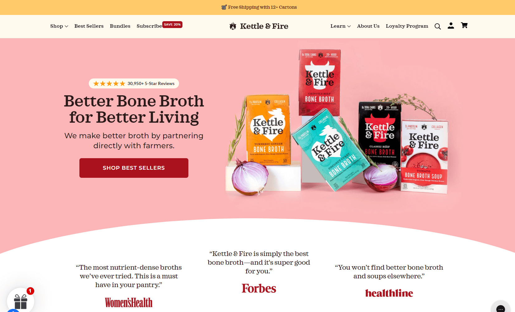
Kettle & Fire, a company that sells bone broth online, has a design that stands out from the crowd. At first glance, the site appears to be a typical ecommerce layout. However, as you explore further, you’ll notice many unique and engaging elements that reflect the brand’s personality.
One of the most striking features of the site is the use of eye-catching visuals. Colorful images of vegetables, which are key ingredients in the product, are scattered throughout the site. These photos not only add interest and visual appeal, but they also help to reinforce the brand’s commitment to natural and healthy ingredients.
Another standout element of the design is the playful use of language. The brand’s slogans, such as “Warm your soul” and “Yummy in the tummy,” add a quirky and fun touch that sets Kettle & Fire apart from more staid and serious competitors.
In addition to these features, the site also boasts a clear and easy-to-navigate layout. Customers can quickly find the product they’re looking for, read about the company’s story and values, and explore customer reviews and testimonials.
Kettle & Fire’s website design is a great example of how strong brand identity can be reflected in every aspect of a company’s online presence. By using creative visuals, playful language, and a user-friendly layout, the brand creates an engaging and memorable experience for its customers.
20. Endy
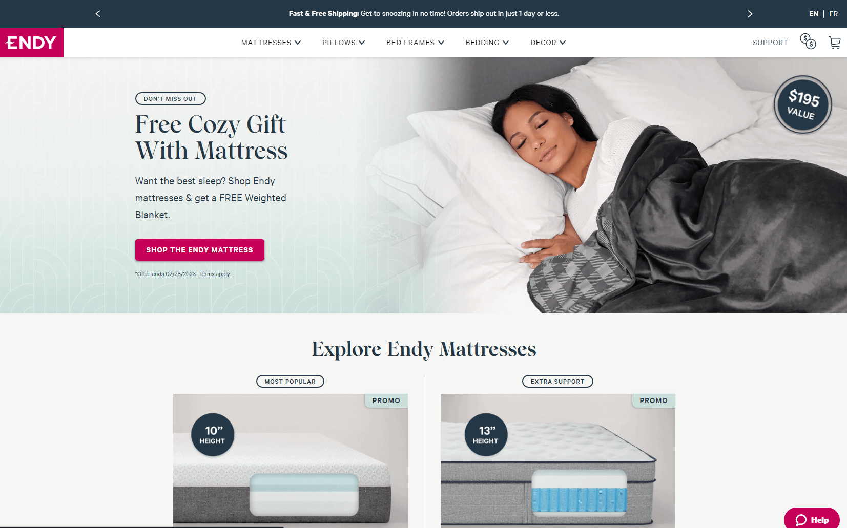
Endy, a Canadian mattress e-tailer, breaks the norm of playing it safe in the industry with their bold website design and color palette. While most mattress brands stick to the traditional white color scheme, Endy adds a splash of bright pink to their logo, CTA buttons, and headlines, creating a fresh and modern look.
The website’s product pages are a standout feature, offering detailed product images, animated GIFs, and videos showcasing the impressive features of their mattresses. The combination of visual elements provides a comprehensive understanding of the product and helps potential customers make informed decisions.
Endy also features a helpful “Find Your Perfect Mattress” quiz that guides customers through a series of questions to help them find the right mattress for their sleeping preferences. The website’s user-friendly interface and engaging design are a testament to the company’s commitment to providing a seamless customer experience.
Grow with a Website
It’s important to remember that your website design should be tailored to your particular business and its target market. By taking the time to plan and create a well-designed website, you can ensure that you are making a powerful first impression with potential customers.
By researching, experimenting, and collaborating with experts in the field, you will be able to craft an amazing website that will help your business stand out from the crowd and attract more customers. That is why it is so important to choose a platform wisely and make sure all of your plans are executed correctly – after all, a website could be the difference between success and failure for any online business!