|
Getting your Trinity Audio player ready...
|
If you want to start taking on this developing world of online presence, the best place to begin is with your construction logo. It’s more than just a visual representation of your company – it’s the first impression you give potential clients and customers.
And just like with your website design or your business cards, your logo design should be designed to highlight all the aspects of your business that are recurring points of interest for clients (such as quality, reliability, etc.).
It is no question that if you’re in the construction business, you understand how important it is to start things off right.
You want your logo to tell your audience that it takes skill and precision to work as a successful contractor. We’ve created some great examples below of logos that will help you get that foundation built quickly and efficiently!
The construction industry is always booming, and it’s never been so easy than to start your own company. Creating a logo is the first thing you should do to start promoting your company.
Good logos are crucial for businesses to succeed, especially when considering the long-term branding strategies of your construction business.
And when you’re in an industry that deals with dangerous tools and work environments every day, you want to set yourself apart from the competition by designing a logo that tells your audience that your business is reliable, responsible, and trustworthy.
How to Make a Contruction Logo
- Enter your Brand/ Company name
- Select Industry (Construction, Building, etc.) use the right keywords
- Select an Icon That represents your business well
- Generate your Construction logo
- When you are done you will receive your construction company brand guidelines. (Brand Book)
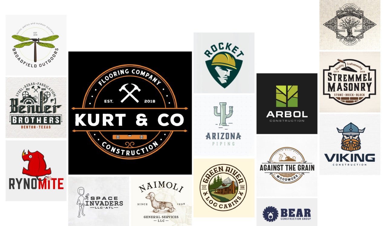
Check out these construction business logo ideas for inspiration of some of the best construction logo designs:
Choose the Right Icon for your Construction Logo
Choosing the right icon is crucial for a successful construction logo design. If your business choice of logo is not well thought out, you might end up with a logo that is not able to reflect the true nature of your business.
Construction businesses are not exactly known for their artistic abilities or creative flair. So while there are some basic guidelines to follow while designing a construction logo, these are not hard and fast.
A good way to get started is by looking at logos of successful construction companies in your industry, reading customer surveys, analyzing feedback on social media sites, and asking for help from other professionals in the industry.
The most important thing to remember while designing a construction logo is that it should clearly convey what your company does and how it differs from other brands in the industry.
Construction Logo Considerations
It should also have an immediate impact on potential customers, which means it should be easy to read and understand. The following are some ways of creating a good construction logo:
- Develop a unique name for your business
- Building off of an existing name or identifying symbol that already exists or has already been successfully used in the industry
- Using an iconic element that represents your ideal customers (such as the blue sky) or something that represents your brand (for example, using yellow in the background of your logo)
- Using simple strong fonts (and avoiding fancy fonts altogether) in all branding materials, including marketing collateral like business cards, letterheads, signage, and websites
Choosing the right construction logo can be a daunting task. There are so many logo designs to choose from and it’s easy to get lost in the details.
By choosing your construction logo carefully, you will ensure that your logo will be an important branding tool that not only helps to promote your company and projects but will also present a professional image to those who see your logo every day.
When choosing a Construction Logo, there are many things to consider:
What type of company are you in? When it comes to choosing a logo design for construction companies, there are three main types available:
- General Contracting
- Specialized Contracting
- Builders
Each type applies slightly different rules and tips to help you decide which type of logo is best for your business:
General Contractors
General contractors provide all types of services and work on all types of projects. They include general building contractors as well as electrical contractors. A general contractor would usually have their own individual logo or simply use the same logo as the company name.
Specialized Contractors
These contractors generally specialize in specific markets, such as building specialty homes or commercial buildings. Some specialized contractors may only execute specific tasks for a company, such as electrical or plumbing services or even landscaping. Specialized contractors usually have their own individual logos that reflect their field of expertise.
Builders
Builders take care of all aspects of building a structure from start to finish, from site preparation and foundation work through roofing and siding installation.
Choose the Fonts for Your Construction Logo
It’s important to choose a font that will appropriately convey your message. Although it can be easy to get carried away with fonts and design elements, your goal should be to create a cohesive and recognizable logo that is simple and clear.
If you’re not clear on what you want your logo to convey, or how it will be used, think about the type of company you’re designing the logo for and how it will be viewed visually.
The right fonts can make all the difference in the world. It’s tempting to go for big, bold, and flashy, but those can’t be used for every project. A more subtle font, such as a serif or sans-serif, is often more appropriate.
Serif fonts are characterized by small lines on the outside of capital letters. Sans-serif fonts have no such lines, making them appear very clean and modern.
These take a little getting used to for people not used to seeing them, but if you want a unique look that stands out from other construction companies, they’re worth considering.
There are many great logo fonts available today, but it’s important to consider your audience when selecting the right font. A construction logo should grab the attention of your audience and create an immediate connection with your brand. Some of the most popular font choices for construction logos include:
- Bembo (a serifed typeface)
- Cooper Black (a sans serif typeface)
- Helvetica (a sans serif typeface)
- Impact (a serifed typeface)
- Franklin Gothic (a sans serif typeface)
Picking a Color
When it comes to choosing your construction logo, you will want to consider the colors that your business uses on a daily basis. This is the primary visual that people see when they look at your business or company logo, and it plays a big role in how people perceive your business.
There are numerous colors and shades to pick of your color pallet and they all have their own distinct characteristics. Some of these include:
Blue
Blue is a great color for construction projects and the color of the water. The color blue projects and ideas tend to be clean and clear while also being soothing and calming. This is a very popular color for construction projects, reminding people of sky blue water, the ocean, and the sky.
Gold
Gold is also a great color choice for construction logos. Not only does this color match blue perfectly, but it works well with such other construction colors as brown, tan, and silver. Gold stands out from other colors because it’s shiny, bright, and bold.
People can easily recognize gold logos when they see them because there is nothing else in the design that could be mistaken for it.
Black
Black can be a great choice if you want a simple yet powerful logo for a construction company or any other type of company in general. If you want to build up your image by using black, then you might want to consider this option.
Black is also very useful in marking out important details on a design. It helps draw attention to them without distracting from them over-powering everything else in the design.
If you are looking for a professionaly designed logo you can contact us to talk.