|
Getting your Trinity Audio player ready...
|
When amazon.com was launched in 1995, it was just a book seller with a tagline “earth’s biggest bookstore”.
The company is named after the mighty Amazon River as way of setting itself up for spectacular failure or spectacular success. The later seems to be what the business is being driven by to this day.
Initially, the company was named “Cadabra” when it was founded in 1994. Because of their unique selling point, amazon grew to a revenue of over $20 000.00 per week in the first two months.

The First Amazon Logo
The first Amazon Logo in 1995 incorporated an “A” with an embedded Amazon River Shape. The black and white version of the logo appeared for the first 2 years together with the Zebra version for only a year.

1998 Redesign of Amazon Logo
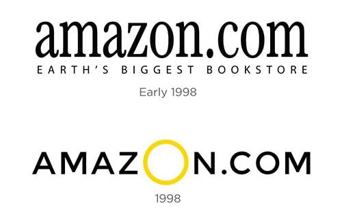
In 1998, Jeff Bezos, the owner of Amazon, decided to redesign the logo. The firm Turner Duckworth was the go-to for this, which resulted in two logos. The first was the words amazon in a black serif font with the tagline “Earth’s biggest bookstore” in caps.
The logo didn’t show off the friendly look that Amazon wanted to portray, so later that year, they added a little O in yellow. This logo was only used between 1998 and 2000.

The New Amazon
The year 2000 for Amazon came with some amazing changes that would see the company grow and its image as a customer centric brand being fully realized.
The amazon logo we see today was introduced in 2000 to resemble a smile. This came after the yellow line from A to Z was slightly curved and an arrow introduced in the design.
The amazon logo shows that the company offers a range of products from A to Z. This logo was able to portray the original meaning with a smile. This helped the company represent its great customer service.
According to the Turner Duckworth agency, Jeff Bezos attended all meetings for the logo project an approved everything himself. This led to a lot of time saved on the project delivery. The logo design process was cut shot and was quick.
The introduction of the smile came with the amazon packaging boxes “smile boxes”. This became a good addition to marketing as millions of people had a good impression of the company every time they received a smile in their doorstep.

Like Amazon, it may take a few changes.
A logo is a crucial part of your business. Like Amazon, it may take time to find the right logo. You may sometimes be forced to change your logo because your brand is evolving and needs to find the right look.
You should, however, have the patience as Jeff Bezos did. That way you can create a logo that is versatile and creates the best representation of your business. Even if it means having to change your logo several times.


