|
Getting your Trinity Audio player ready...
|
A real estate logo design conveys your message and creates a big impression on your target market. Potential clients want to do business with companies that project a professional image. Also, the properties you manage or own should be well-represented in a memorable way.
There are two reasons why it is very important to use great logos for your real estate business. First, you want it to stand out in the market. The second reason is that you would want it to help with marketing your services and products, especially when it comes down to buyers and sellers.
Apart from these two reasons, consider these guidelines when creating a logo for your real estate business.
Real estate logo designs are one of the most important aspects of your business. But how do you decide on the right one?
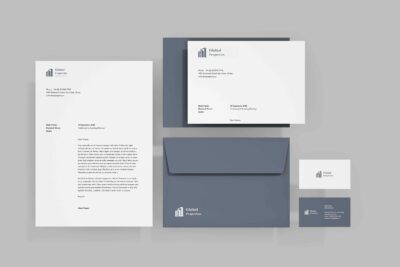
Logo
A logo is a visual representation that encapsulates a brand’s identity, values, and essence in a single, recognizable symbol.
How to make your own real estate logo
- Choose a Company name.
- Select Industry (Real Estate, Property management, etc.) use the right keywords.
- Select an Icon That represents your business well.
- Generate your Real Estate logo.
Choosing the Right Icon
It’s important to have the right icon on hand for your real estate logo. It’s also equally important to have a good reason for using one.
The icon is the visual representation of your business or service, so it should be unique and memorable. The icon can be any shape or size, although there are some things that you should keep in mind when selecting an icon.
- Keep the icon simple and clean.
- Keep it consistent with your brand, but not too repetitive.
- Not too formal; not too informal; just right!
Deciding on the Fonts
Your real estate logo is a very important marketing tool. It needs to be unique and easy to identify.
Pick an appropriate typeface for your company’s name and use it consistently in all your marketing materials. Also, make sure you have a version of your company logo in different sizes. You can use it on the website or in any other marketing material. You can always resize it later when needed.
One of the most important decisions you can make when designing your logo is choosing the font. With the right font, your logo will become a memorable emblem for your brand.
Even if you’re using an existing font for your logo, you should keep it in mind during the design process. The font should be versatile enough to work with other designs, including photography and graphics. It should also be easy to read in smaller sizes, including on cards and buttons.
Deciding on the fonts
Your real estate logo is a very important marketing tool. It needs to be unique and easy to identify.
Pick an appropriate typeface for your company’s name and use it consistently in all your marketing materials. Also, make sure you have a version of your company logo in different sizes. You can use it on the website, or in any other marketing material. You can always resize it later when needed.
One of the most important decisions you can make when designing your logo is choosing the font. With the right font, your logo will become a memorable emblem for your brand.
Even if you’re using an existing font for your logo, you should keep it in mind during the design process. The font should be versatile enough to work with other designs, including photography and graphics. It should also be easy to read in smaller sizes, including on cards and buttons.
Deciding on the fonts
Your real estate logo is a very important marketing tool. It needs to be unique and easy to identify.
Pick an appropriate typeface for your company’s name and use it consistently in all your marketing materials. Also, make sure you have a version of your company logo in different sizes. You can use it on the website or in any other marketing material. You can always resize it later when needed.
One of the most important decisions you can make when designing your logo is choosing the font. With the right font, your logo will become a memorable emblem for your brand.
Even if you’re using an existing font for your logo, you should keep it in mind during the design process. The font should be versatile enough to work with other designs, including photography and graphics. It should also be easy to read in smaller sizes, including on cards and buttons.
Choosing color
Real estate logo designs are not simply an exercise in making a logo. They are a powerful marketing tool for your real estate company.
The color of the logo is of paramount importance because it will appear on many different types of print.
It doesn’t matter if your logo is black and white, you need to consider the color scheme that will work best for your business. Consider Blue, followed by black, green, grey, then red, orange, and yellow.
There are many colors that are great for real estate logos. Some colors can are neutral while some can be bold and dramatic. The point is to use caution when coming up with your own color scheme. Make sure it has positive connotations.
Your color scheme doesn’t need to be just one or two colors. Perhaps you use three or four colors for your logo and then use them again across various mediums such as:
Social media
Social media accounts like Facebook can promote your business and attract customers. Using colors like those used in your logo would help reinforce your brand identity when using these platforms.
Website
Your website color schemes should also be similar to what you use in other areas such as social media platforms. This gives an added visual cue for potential customers when viewing your website.
Email marketing campaigns, such as newsletters and email blasts, can also work as marketing tools for your business. They also have to follow the same color pallet.
The Logo Layout
The Logo Design Layout is a very important part of the branding process. This part should be done properly to create a well-designed logo.
A correct Logo Design Layout will give your logo a professional look. Avoid the confusion that comes with logos that don’t work well together.
We have to look at the following factors while creating a good Logo Design Layout. A small-size logo looks better than a large-size one in most cases, so choose a logo in which you can fit all the required information without any issues. Getting the right size is essential for a good-looking logo.
If you are considering utilizing a logo with your real estate business, you must be sure that the logo design layout will best enhance the work of your real estate business. A logo design layout can vary from one-real estate business to another.
Your logo design layout for a real estate company must be simple and easy to read. It should have a presence in the market that is bigger than just the logo design alone. It should stand out from other real estate companies in the market.
The clientele should be able to recognize it easily in case they need it by name or if they are trying to find it online.
The unique characteristics of the product offered by your real estate firm are also an important factor. Consider factors like quality, safety, reliability, and services offered. This gives you an identity that stands out in the market.
Logo design tips to keep in mind
To create a unique and professional look, you must consider different combinations of colors. The most effective combination is using the black and white color combination.
The combination of these two colors will give your logo a very luxurious and modern look. In addition, it should be large enough to remain visible in small space. For this purpose, consider the following tips:
- Use a combination of black and white colors for your logo. It can be a simple design or a complex one with a lot of details. But the main thing is that it must be attractive and should be seen at all times.
- Make sure that your logo has no negative elements that might distract the customer’s attention from the main theme. If necessary, use light shades of gray or yellow to avoid sharp contrasts between different elements of the logo.
- Choose images that are easily This applies to both experts and non-experts of the real estate property industry.