
|
Getting your Trinity Audio player ready...
|
UX stands for user experience. It’s the backbone of successful websites and apps, ensuring that users not only understand the product but also enjoy using it. But what makes a good UX?
According to Zappia, 52% of people say a bad mobile experience makes them lose faith in a company. User experience is becoming an increasingly important factor in developing products and services. Organizations strive to create an overall experience that will delight customers and keep them engaged with their products or services.
To achieve this, brands are putting more focus on creating great user experiences.
A well-designed UX helps people understand how a product works and how to interact with it in order to achieve the desired outcome. All aspects of user experience should be designed with users’ needs in mind – from the aesthetics to its functionality.
To give you some ideas of how UX design can improve the customer journey, let’s take a look at some impressive examples of UX design from different industries.
UX Design
UX Design, or User Experience Design, focuses on designing the experience a user has when interacting with your product or service. It covers all aspects of user interaction with the product, from design to usability, usability testing and more.
What does good UX look like?
Good UX design is about creating a pleasant and intuitive experience for the user. It should be easy to use and understand, with a focus on making the user’s task easier. Good UX designs should be aesthetically pleasing and accessible to people of all ages and abilities. All design elements should work together seamlessly, providing clear visual cues to guide the user.
In terms of functional components, this means that UX designers must consider navigation, layout, typography, content organization, responsiveness, interactivity, and accessibility. On top of that, there needs to be an understanding of how humans interact with technology so that the design can be tailored accordingly.
Ultimately good UX design is about making sure that a product or service is usable, useful, and enjoyable for its users. If all these elements are considered, it will result in an efficient user experience overall.
1. Simplicity
Simplicity is the foundation of good UX design. Without a simple and straightforward design, users may have difficulty navigating an interface or app. This can be detrimental to user experience and satisfaction as it could lead to users abandoning the product out of frustration or confusion.
In today’s digital landscape, simplicity is essential for creating a successful product. Keeping an interface clean, straightforward, and easy to understand promotes usability and makes for a more enjoyable experience for the user.
Simplicity also gives users a sense of control over their experience, allowing them to find what they need quickly and efficiently without having to navigate through endless options.
Good UX design should strive to create an enjoyable and easy environment so that users will continue coming back again and again.
2. Usability
Usability is a key aspect of UX design. It requires great effort to ensure that the user interface is easy to use and understand, while also achieving the desired outcome for users. For usability to be successful, designers must consider factors such as user goals and behaviors, system performance, navigation, task flow, accessibility, and more.
For example, when redesigning an app or website, certain features need to be taken into account such as making sure buttons are large enough to click on easily; having intuitive navigation; ensuring elements are spaced in a way that allows for quick scanning of information; providing feedback quickly when something goes wrong; and so on.
The goal is to make sure the user experience is straightforward with no unnecessary steps or distractions. Hossein Majidinejad’s design may be aesthetically pleasing but it fails in this regard since it has a complex layout that may not be very intuitive or easy to use.
While aesthetics play an important role in UX design, usability should be prioritized if the goal is to create a product that people will want to use over and over again.
3. Visual aesthetics
Visual aesthetics are one of the most important aspects of UX. After all, users decide whether they like your website/app or not in 50 milliseconds! That’s why it’s essential to create a visually appealing design that draws in users and encourages them to stay.
A good visual design should be attractive and organized, with consistent typography, color schemes, and images. It should also allow for easy navigation so visitors can find what they’re looking for quickly. Other factors such as page loading speed, animations, and use of white space should also be taken into account when designing a website or app.
With the right visual elements in place, you can make sure your UX is up to par with the competition – no matter how far away Mars is!
Top 24 Inspiring UX design examples
When it comes to user experience (UX) design, there is no one-size-fits-all solution. UX design must be tailored to the unique needs of both B2B and B2C customers. To illustrate the importance of a well-designed user experience, here are some top examples of how companies have created successful UX designs for their customers:
1. Google: Loading Super Fast Since 1997
The Google Store has come a long way since its inception in 1997. The tech giant has recently shifted its focus to achieving faster loading times and improving the user experience (UX) on its ecommerce platform. Google understands that every second counts when it comes to keeping customers engaged and preventing them from leaving the site.

The company has mastered the art of loading its website extremely fast, making sure that users do not have to wait for more than a second for it to load. This lightning-speed performance has put Google ahead of its competitors and has helped it to retain customers who demand instant gratification.
In addition to being fast, the Google Store has also made its checkout process efficient and user-friendly. The seamless checkout process takes customers from their cart to confirmation quickly, making the process hassle-free and easy to navigate. With this efficient checkout process, customers can easily complete their purchases without getting stuck or feeling overwhelmed.
In the current ecommerce landscape, faster loading times and efficient checkout processes have become crucial factors in determining the success of an online store. The Google Store’s UX design and emphasis on speed have set a benchmark for other ecommerce platforms and have proven that investing in these elements can lead to greater customer engagement and improved sales.
2. Apple’s web store is one of a kind
Apple’s web store is renowned for being one of the most exceptional examples of user experience (UX) design. Unlike other websites, Apple’s website is not only an e-commerce platform but also offers an enjoyable browsing experience. The website is a perfect blend of product information and lifestyle content, and this unique approach has made it more engaging and successful.
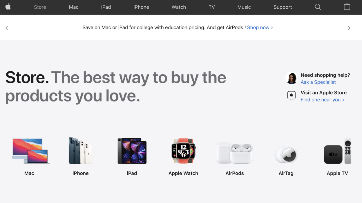
When browsing for an iPad, we chose to visit Apple’s web store instead of the usual tech stores. To our delight, we found that the website was more than just a product page – it was smooth, easy to use, and kept us engaged for much longer than expected. This experience demonstrates the importance of UX design when creating a website that engages users and encourages them to stay longer.
Apple’s web store’s UX design is noteworthy in its ability to create a seamless experience by blending product information and lifestyle content. Users can access interesting and relevant lifestyle content such as the latest shows available on Apple TV, while also viewing details about the newest Apple Watches. By combining product information and lifestyle content, Apple has created a perfect combination of features that keeps users engaged and returning to their website.
In conclusion, Apple’s web store sets a benchmark for UX design. It is a great example of how to create an e-commerce website that is both informative and engaging. If you want to create a website that encourages users to stay longer and engage with your brand, it is essential to prioritize UX design in the development process.
3. Uber: mental models applied to perfection
Uber is a company that has consistently been praised for its UX design since it was first launched. One of the things that set Uber apart is its ability to cater to both riders and drivers, who require different mental models and personas. This is a highly complex task for any UX designer, but Uber has managed to understand both sides perfectly.
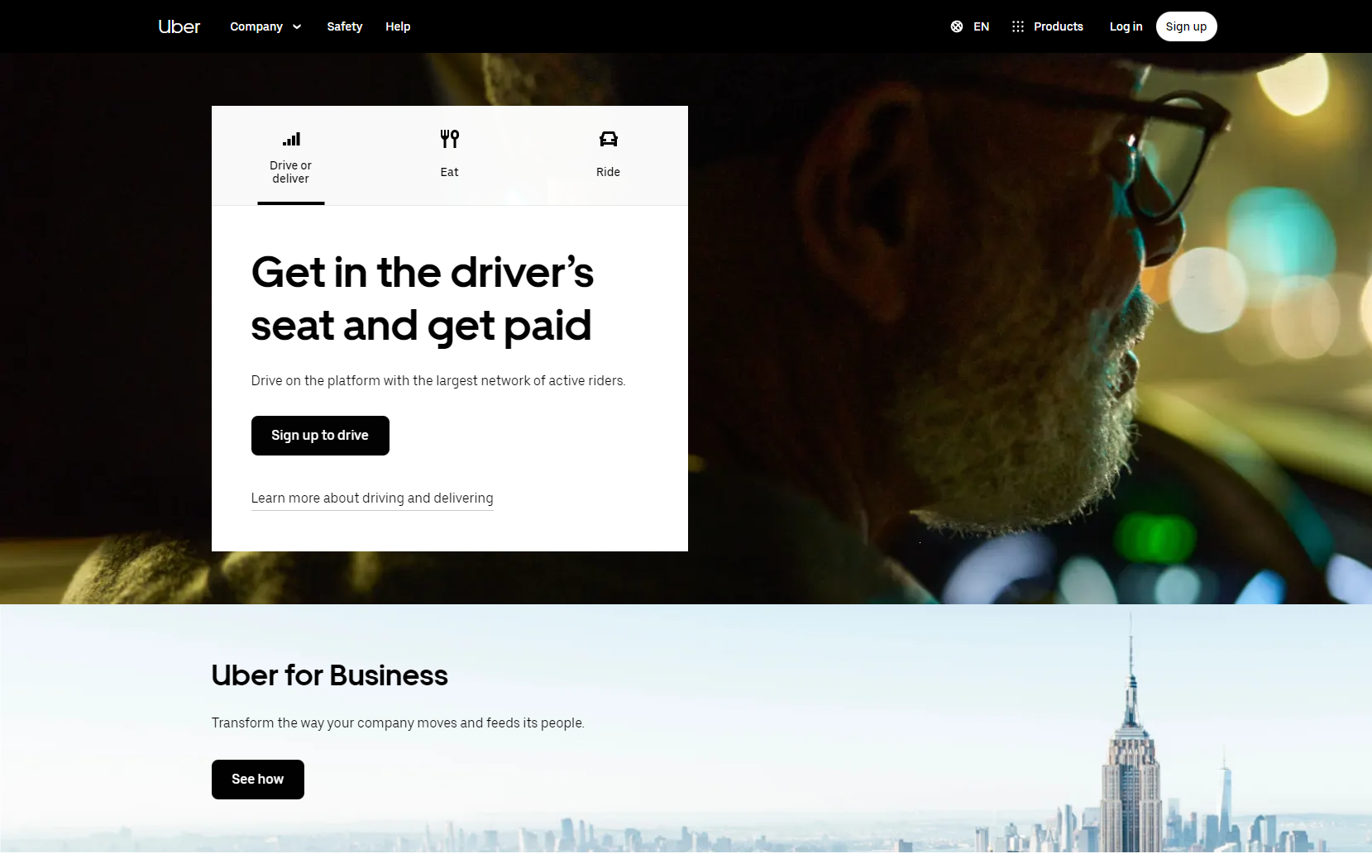
When it comes to riders, Uber offers an easy way to get from one place to another. The app allows riders to quickly find and request a ride, as well as see the driver’s location and estimated time of arrival. The app also provides riders with information about the driver, such as their name and a photo, as well as the make and model of the car they’ll be riding in.
For drivers, Uber offers a secure platform that pays fair wages and provides them with the necessary tools to find customers quickly and safely. The app provides drivers with information about customer pick-up locations, as well as estimated fares and customer ratings. This makes it easier for drivers to plan their routes and manage their time effectively.
Overall, the success of Uber can be attributed in large part to the quality of its UX design. By understanding both the needs of riders and drivers, Uber has been able to provide a comprehensive service that meets the needs of both sides. The result is an easy-to-use app that has revolutionized the transportation industry and made Uber one of the most successful companies in recent years.
4. Netflix’s autoplay features
Netflix‘s autoplay features have revolutionized the way users engage with the platform, sparking debate among audiences and UX experts alike. The ‘play next episode’ feature, which automatically starts the next episode of a series, has been both praised and criticized for promoting binge-watching behavior. While some users appreciate the seamless viewing experience, others argue that it encourages unhealthy screen time habits.

Another innovative feature is the autoplay trailer, which gives viewers a sneak peek into movies and series that they might be interested in watching. This feature has proven to be effective in keeping users engaged with the platform and discovering new content. By anticipating user needs and preferences, Netflix has created a personalized experience that caters to individual tastes.
Despite the controversy surrounding autoplay features, it is undeniable that Netflix has mastered the art of UX design. By providing an effortless, intuitive experience for users, they have cemented their position as a leader in the streaming industry. Netflix’s focus on UX design has also contributed to its success as a business, as they continue to attract and retain customers with its user-friendly platform.
5. Miro’s user onboarding
Miro, an online collaborative whiteboarding platform, has made waves in the tech community with its user onboarding experience. Miro recognizes that onboarding is crucial in delivering value to its customers, and it shows in the design of its platform. The company understands the user’s job to be done and tailors its modal popups to their in-app actions, guiding them toward their Aha! moment.
The popups are unobtrusive and offer helpful guidance along the way as users build out the board they need. This approach allows users to feel comfortable using the platform without feeling overwhelmed by an onslaught of features.
Effective onboarding requires a combination of understanding the user’s needs and providing supportive tools that quickly help them achieve success. Miro has taken a great approach by implementing this strategy, demonstrating the value it brings to those looking to get the most out of their app. By putting the user’s needs at the forefront, Miro has created an onboarding experience that helps users to achieve their goals and use the platform more efficiently.
6. Mailchimp’s password guidance
Mailchimp’s password guidance is a prime example of how effective UX design can enhance security while improving the user experience. Many online users have fallen into the habit of using weak, easily guessed passwords, making their accounts vulnerable to attack. Mailchimp’s approach encourages users to create stronger passwords without making the process too complicated or frustrating.
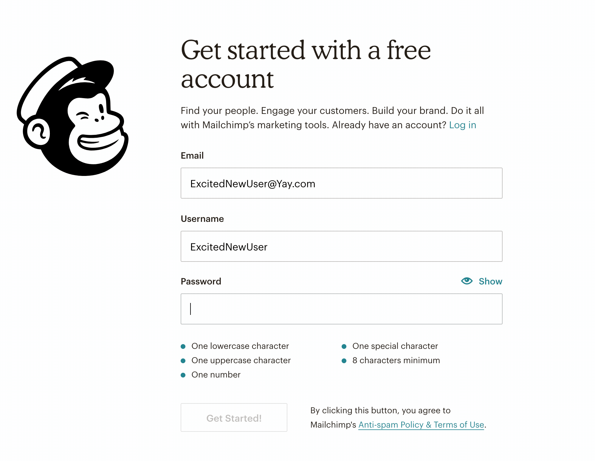
The step-by-step guidance offered by Mailchimp breaks the password creation process into easy-to-follow stages, explaining the benefits of using stronger passwords and offering examples of best practices. The result is an interface that empowers users with the knowledge and tools they need to create more secure passwords while keeping them engaged.
Moreover, the tone of Mailchimp’s guidance is friendly and helpful, never patronizing or overly formal. This is consistent with the company’s broader commitment to delivering excellent customer experience. By putting user needs first and providing accessible information, Mailchimp builds trust with its customers, ultimately leading to greater loyalty and satisfaction.
Mailchimp’s password guidance is just one example of the company’s dedication to delivering exceptional UX design that prioritizes customer safety and satisfaction.
7. Revolut’s customizable app
Revolut’s customizable app has disrupted the banking industry by putting the power of personalization in the hands of its customers. The company’s innovative approach to UX design has allowed them to offer a unique experience that not only meets but exceeds customer expectations.
By providing users with the ability to tailor their app to their liking, Revolut has made banking more accessible, user-friendly, and fun.
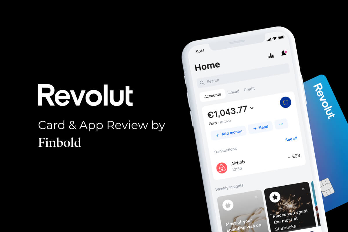
Revolut’s design philosophy is centered around providing customers with a sense of ownership over their products. This is evident in their app, which is designed to be as flexible and customizable as possible. Users can choose from a range of backgrounds and icons, as well as tailor the app’s layout to fit their preferences. This level of customization allows users to personalize their banking experience, making it more enjoyable and engaging.
By giving customers the power to make the app their own, Revolut has created a sense of community that is unique in the banking industry. This has resulted in increased customer loyalty and retention. The company’s emphasis on personalization has also helped them stand out in a crowded marketplace. As more and more customers demand personalized experiences, Revolut’s customizable app has set the standard for what a modern banking app should look like.
Revolut’s customizable app is a testament to the power of user-centric design. By putting the needs and desires of its customers first, the company has created a product that is both innovative and accessible. As the banking industry continues to evolve, Revolut’s approach to UX design is sure to inspire others to follow suit.
8. Duolingo’s gamified experience
Duolingo has become synonymous with gamified learning experiences. The platform is a great example of how gamification can be used to create an engaging and rewarding user experience. The brand has created a winning formula by combining animations, a light-hearted tone of voice, and various gamified elements such as levels, streaks, and rewards to make learning a new language enjoyable.
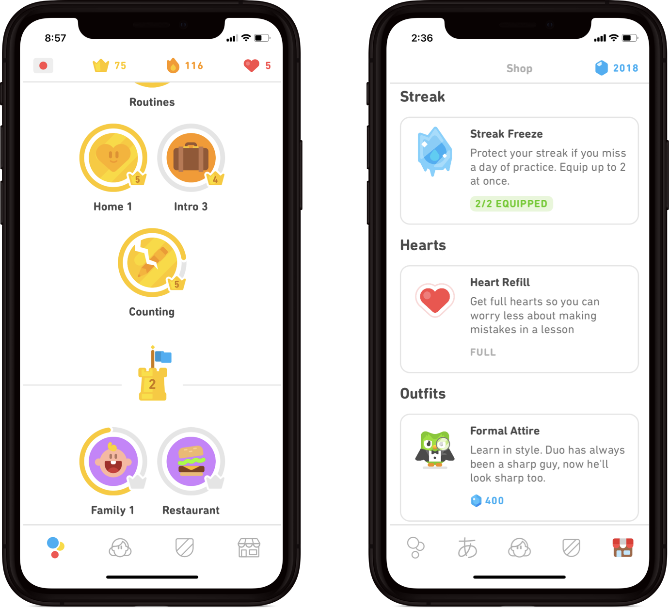
Duolingo’s gamified experience has proven to be successful, with the market for gamification expected to reach $30.7 billion by 2025. Through its UX design, the platform has shown that it is possible to make learning fun while still challenging users to keep learning.
By providing a visually appealing and interactive interface, Duolingo makes learning a new language accessible and enjoyable to a wide range of users. The ability to track progress, receive rewards, and compete with others further adds to the sense of accomplishment and satisfaction.
Taking inspiration from Duolingo’s example, brands can explore ways in which they can incorporate gamification into their own experiences to keep customers engaged. By making learning and skill-building fun, brands can attract new audiences and keep them engaged in the long term.
Duolingo’s gamified approach to learning has set a new standard for UX design, demonstrating how gamification can be used to make complex topics more accessible and enjoyable for a broader audience.
9. Spotify’s Year Wrapped
Spotify has developed a unique and personalized way to engage users through its Year Wrapped feature, which demonstrates how powerful user data can be when it comes to designing an engaging experience.
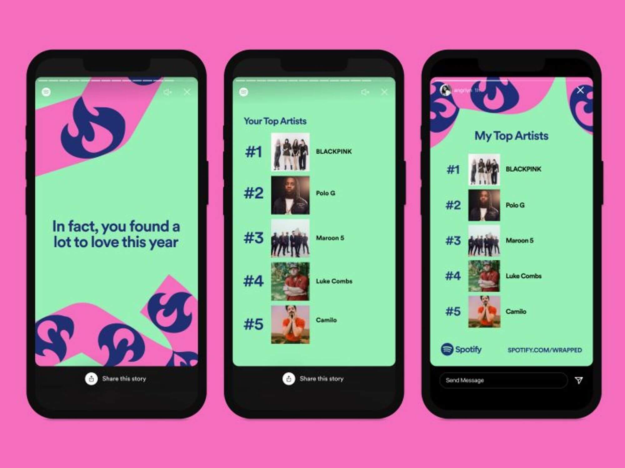
The platform’s ability to use the vast amounts of user data it collects to create something that is both personalized and shareable is a great example of how brands can use data to build customer loyalty.
Through the use of the year-in-review format, Spotify’s Year Wrapped feature delivers a snapshot of each user’s listening habits throughout the year, using playful animations and graphics to make the experience more enjoyable.
The Year Wrapped feature is not only engaging for users, but it also has a social element to it. Users can share their personalized stories on social media platforms like Twitter and Instagram, helping to spread the word about the feature and ultimately driving more engagement on the platform.
This type of user-generated content is not only free marketing for Spotify, but it also helps to create a sense of community around the platform.
By analyzing user data and creating a feature that is both personalized and shareable, Spotify has shown how powerful data can be when it comes to UX design. This feature has become an anticipated annual event for many users and has contributed to the platform’s continued success.
The Year Wrapped feature is a great example of how brands can leverage data to build an engaging user experience that drives customer loyalty and engagement.
10. Grammarly’s onboarding emails are a huge success
Grammarly’s onboarding emails have been widely recognized as an impressive success. While the tool is well-known for its comprehensive spelling and grammar checker, it has also developed an incredibly effective onboarding email system. Upon signing up for the service, users receive regular emails with helpful tips and advice on how to use the software.
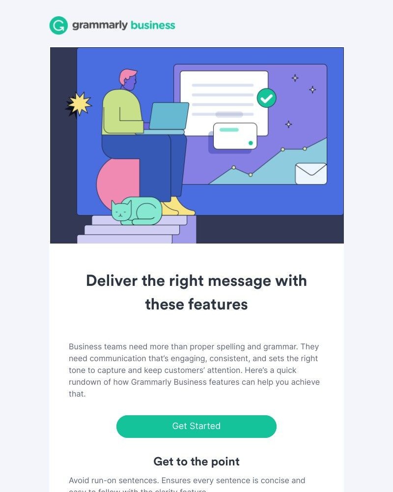
The emails are designed to educate users about all the features and capabilities of the platform, encouraging them to utilize the service to its fullest potential. This approach has been hugely successful for Grammarly as it helps users understand how to get the most out of their account and encourages them to use all its features. In addition, the emails serve as a valuable reminder to users of the service’s benefits and features, helping to keep them engaged with the product over time.
Beyond education, the onboarding emails also offer helpful reminders such as when to check for potential errors or when to save drafts. These touches provide an extra layer of usability that makes Grammarly stand out from other services. By incorporating useful and timely reminders into their email strategy, Grammarly provides users with a more enjoyable and productive experience.
Overall, Grammarly’s onboarding emails showcase the power of thoughtful and effective email design. By providing a comprehensive education on their product, they have created a pathway for new users to engage with the platform in a meaningful way.
11. LinkedIn offers one of the most useful onboarding checklists
LinkedIn is an invaluable tool for anyone looking to advance their professional life. It offers a range of features such as job searching and recruiting, and a user-friendly platform for networking. The platform’s success is due in part to its onboarding checklist, which helps new users understand how to use the product effectively.
From the moment a new user logs in, they are presented with a series of tasks to complete, such as filling out their profile, connecting with colleagues, and joining relevant groups. These to-do lists serve as a guide for new users and provide a clear path to follow to get the most out of the platform.
LinkedIn’s onboarding process is designed to be helpful and engaging. When new user completes a task, they are rewarded with positive feedback and suggestions for what to do next.
For example, when a user fills out their profile, LinkedIn provides a checklist of other actions they can take to improve their profile, such as adding work experience, education, and skills. This step-by-step approach makes the process feel achievable and helps users build confidence in their ability to use the platform.
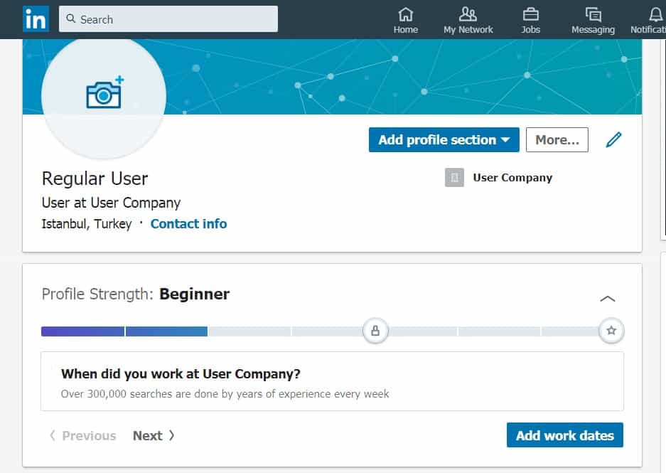
By using checklists, LinkedIn has created an effective onboarding process that helps users fully onboard onto the platform. This approach is not unique to LinkedIn and can be applied to any product or service. Checklists help to break down complex tasks into manageable steps, providing users with a clear roadmap to success.
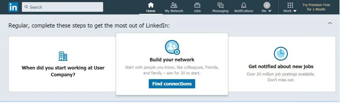
By giving users a sense of progress and achievement, checklists can help build engagement and make onboarding an enjoyable experience.
12. Nike: example of UX design that sells
Nike’s website has a lot to teach designers about how to create a user experience that promotes sales. One of the key takeaways is how to use proximity and visual cues effectively. By understanding these principles, Nike’s website is able to make its product pages a great example of UX design that converts.
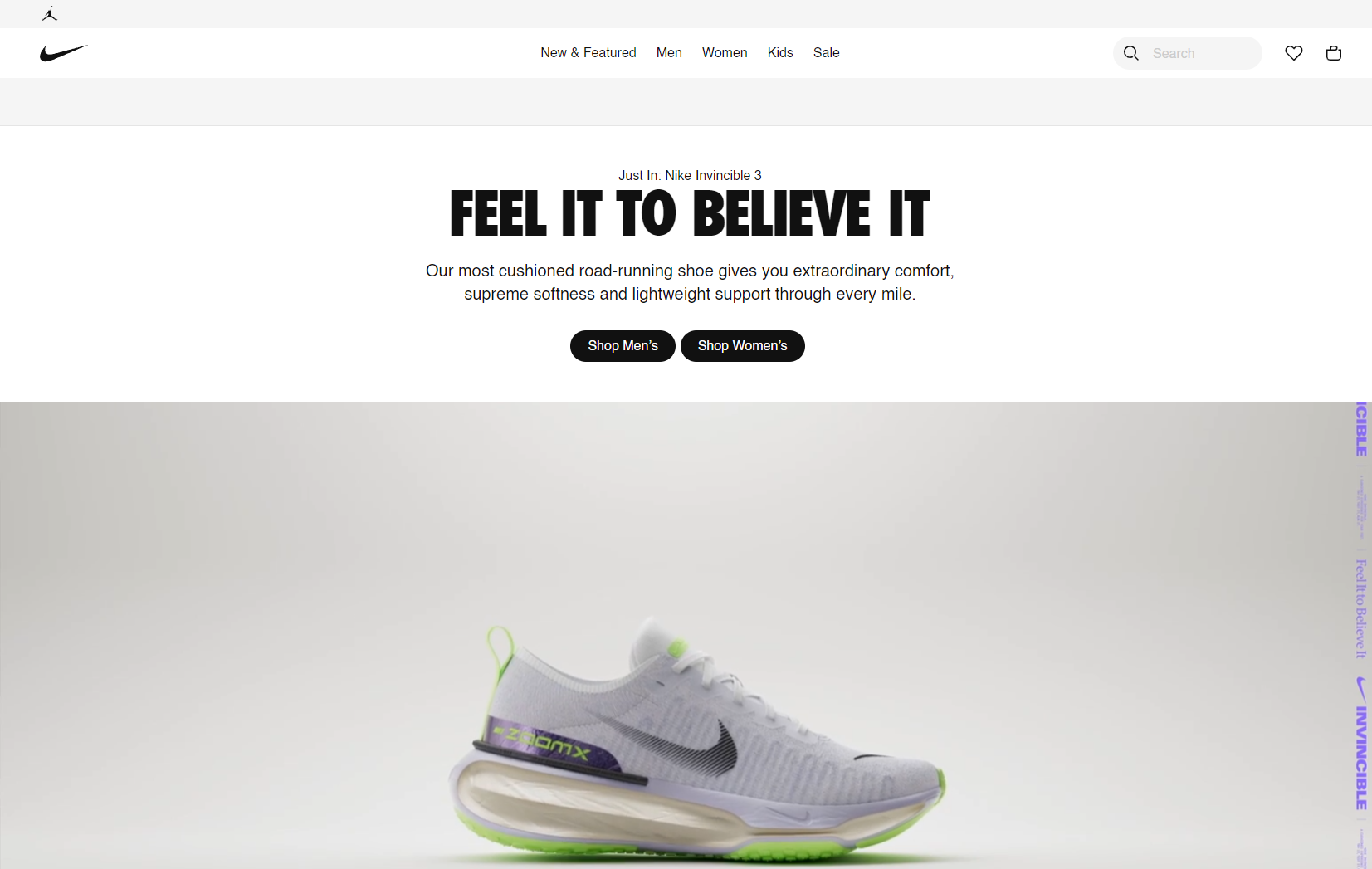
One of the most impressive aspects of Nike’s design is the relationship and proximity of the different elements on the product pages. For instance, the placement of the sizes of the items, the product pictures, and the Add to Cart button is well thought out. Users are able to make a decision about whether to purchase the item or not with minimal effort, since they don’t have to move their cursor or eyes around the page too much. This can be incredibly effective in encouraging people to buy things, because it showcases the products and makes it very easy for users to make a purchase without encountering any resistance.
Another aspect of Nike’s design that contributes to its effectiveness is the way it presents product options. Rather than presenting users with a large number of choices that can be overwhelming, Nike breaks down product options into smaller, more manageable groups. This helps users focus on the options that are most relevant to them, and makes it easier to compare different products. By making it easier for users to make a decision, Nike increases the chances that they will ultimately make a purchase.
Finally, Nike’s website also uses high-quality images to showcase its products, and presents them in a way that makes them look desirable. This can be incredibly effective in driving sales, because users are more likely to make a purchase if they are convinced that the product is high-quality and desirable. By using images that are visually appealing, Nike is able to create an emotional connection with its users that can help drive sales.
Overall, Nike’s website is an excellent example of UX design that is focused on promoting sales. By using principles of proximity, visual cues, and effective product presentation, Nike is able to create a user experience that makes it easy for users to make a purchase. This can be incredibly effective in driving sales, and is something that all designers can learn from.
13. Airbnb’s booking experience
Airbnb’s booking experience is a great example of how to create a user-friendly booking system. By conducting extensive research on user needs and pain points, Airbnb has designed its website to cater to the specific needs of travelers.
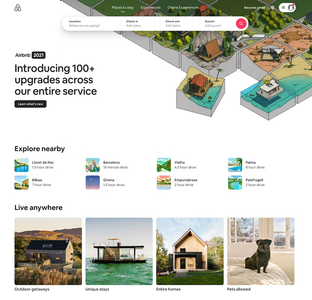
One of the most significant challenges travelers face is finding suitable accommodation. Airbnb’s homepage design addresses this pain point by offering popular nearby destinations, as well as a mix of accommodation options that suit different needs, such as entire homes, pet-friendly homes, and unique stays. This helps to inspire travelers who may be unsure of where to go and what to book.
The booking process is simple and user-friendly, with the “Book” button located prominently at the top of the page. This ensures that users can easily find what they are looking for and book it quickly. In addition, Airbnb provides a detailed description of the property, along with high-quality photos and user reviews. This helps users to make an informed decision before booking.
The lesson to be learned from Airbnb’s design process is to conduct extensive research on user needs and problems and use the data to determine what matters most to them. Once you know what matters to your users, you can design your website to meet their needs and offer a user-friendly experience. By doing so, you can increase user satisfaction and ultimately drive more bookings.
14. We all love how Facebook cares for its
Facebook is a platform with over 2.5 billion monthly active users and 5 new profiles being created every second. The task of providing a good user experience for all these users can be challenging, but Facebook handles it with ease. Facebook personalizes each user’s experience based on their interests and activity on the platform.
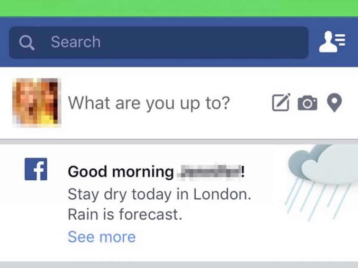
Facebook offers many features that enhance the user experience, including location, language, interest, and activity-based elements. These features make Facebook a unique virtual space for every user. However, the value that Facebook provides to its users is what sets it apart.
Facebook aims to be more than just a social media platform; it seeks to help its users in every way possible. For example, Facebook gives users brief information about the weather in their location for the day, which may seem like a simple thing, but it adds value to the user’s experience.
Facebook’s Safety Check is another feature that provides value to its users. Safety Check allows users to mark themselves safe from an incident that has happened near their location and request their Facebook friends to mark themselves as safe as well.
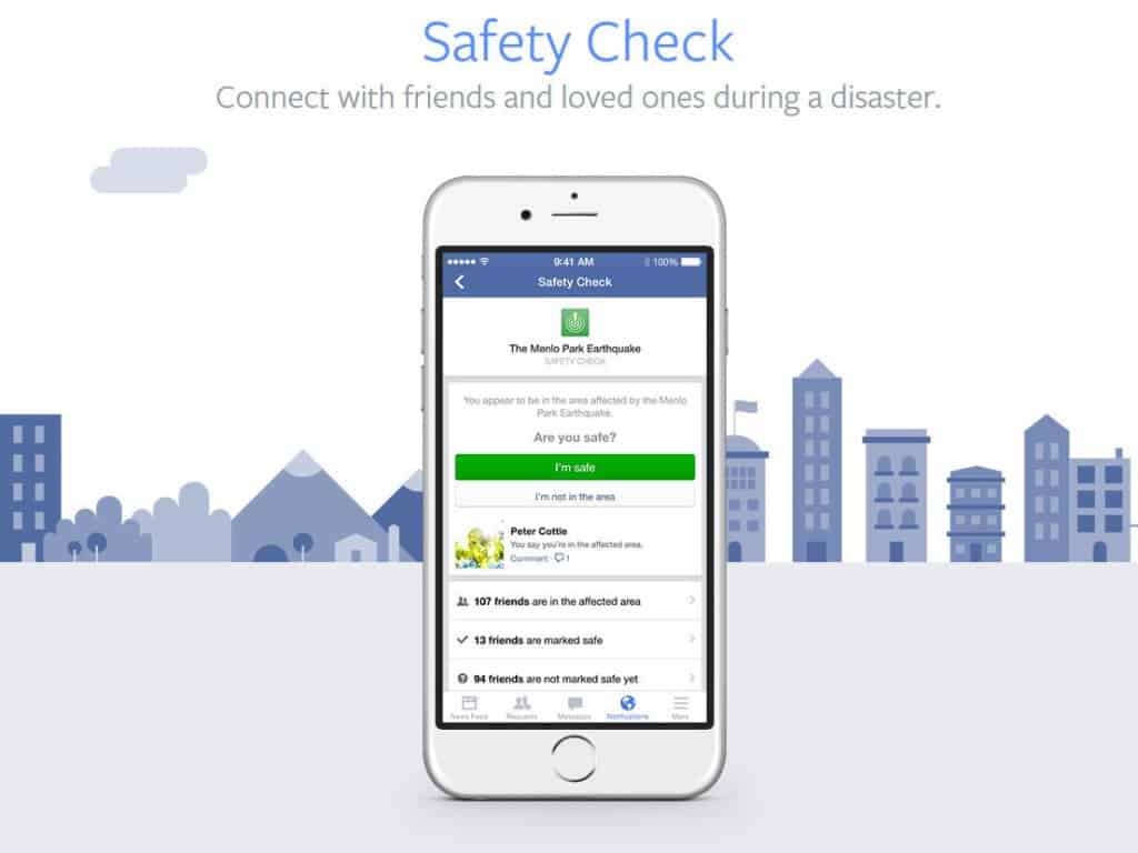
Even though these features might not directly bring profits to the business, they create a bond of trust between Facebook and its users.
By providing valuable features to improve their experience with the product, Facebook shows its users that it cares about their well-being and aims to help them in every possible way. This approach has helped Facebook become a platform that its users love and rely on.
15. Instagram: example of visual efficiency
Instagram’s visual efficiency has made it one of the most popular apps, with its design making it easy for users to spend long hours scrolling through the endless stream of visual content. The app’s visual hierarchy and balance have a wonderful appeal, without overwhelming users in any way.
Instagram’s design is intended to showcase user-generated content, as the majority of screen space is dedicated to it. This careful planning shows how the app’s general layout was structured to highlight the content and allocate space for other features without any unnecessary elements or visual noise.
Despite the app’s focus on visual minimalism, the design team found innovative ways to incorporate features and settings without compromising the user experience. For example, familiar elements like the hamburger menu provide users with a comfortable way to access Instagram’s features.
Instagram’s success demonstrates how a focus on visual efficiency can provide a great user experience while showcasing user-generated content. The app’s clean and well-organized design keeps users engaged, making it an excellent example of UX design.
16. Booking.com: example of a simplified experience
Booking.com’s website is a well-orchestrated travel platform that helps users search and book accommodations with ease.
One of the key features of the website is the search bar, which is fast and efficient, providing users with suggestions that adapt to their searches from countries to cities and even areas. This lazy format design pattern is one of the things that makes Booking.com a prime example of a simplified experience.
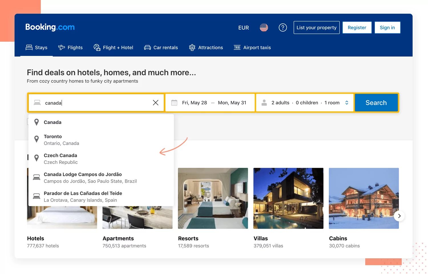
Moreover, Booking.com has made the entire check-out process smooth and user-friendly, requiring very little effort from the user. In fact, the check-out process is considered one of the best in the UX game, comparable to Amazon’s. The website’s user interface is clean, simple, and organized, with every feature and element placed with a purpose to make the user experience as effortless as possible.
The team behind Booking.com has made sure to design the website in a way that puts the user first. The website has been optimized to ensure that users can easily navigate through the site, find what they’re looking for, and make a booking quickly. It’s clear that the designers have done their research to identify the pain points users typically face when trying to find and book accommodations, and have used that data to create a website that addresses these issues head-on.
Booking.com’s success is a testament to the power of a simplified user experience. By making the search and booking process easy, efficient, and straightforward, Booking.com has established itself as a go-to platform for travelers worldwide. The lesson for UX designers is to prioritize user needs and simplify the user experience to create a successful product.
17. Duolingo: example of visual hierarchy
Duolingo has become a go-to app for language learners around the world, especially during the pandemic. Its success can be attributed to its user-friendly design and ability to break down complex topics into manageable pieces.
Duolingo is an excellent example of UX design, showcasing the importance of breaking a long process into small pieces and utilizing visual hierarchy.
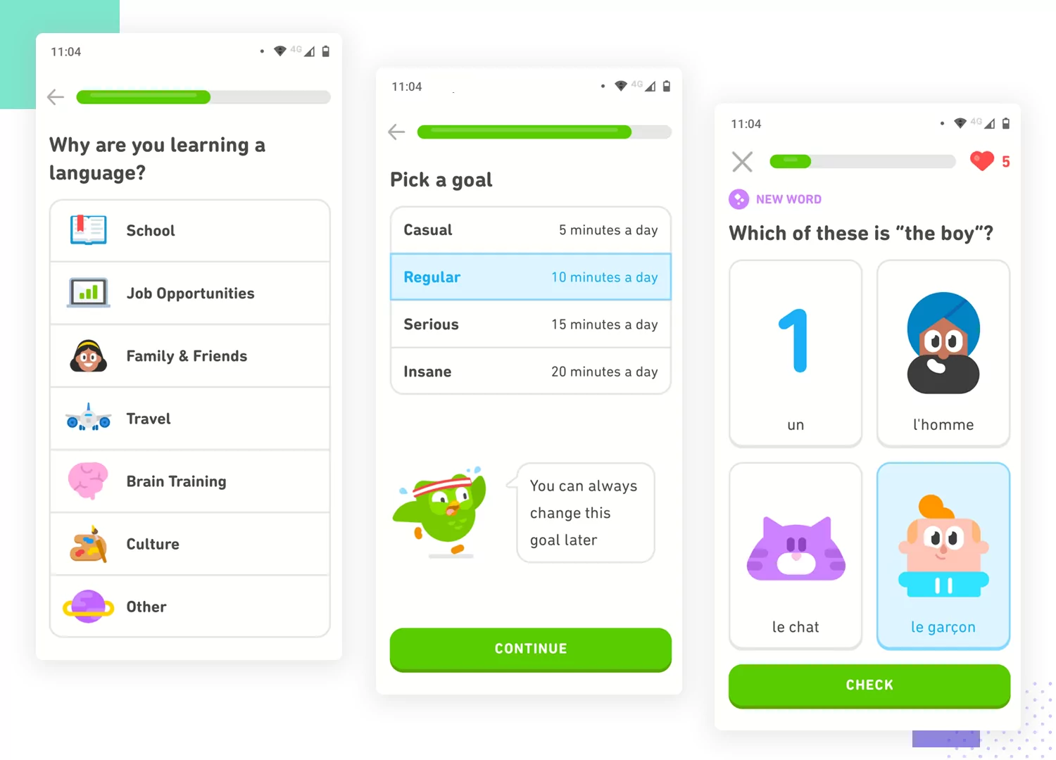
One of the ways that Duolingo simplifies the learning experience is by asking one question at a time, rather than overwhelming the user with too much information. This approach helps users stay focused and engaged, and reduces cognitive load.
Additionally, Duolingo’s UI design is carefully crafted to guide the user’s eye and highlight the most important information. For example, the law of proximity is used to group related elements, making it easier for users to understand the relationship between different elements.
This attention to detail is evident from the very beginning of the user experience. When users establish their preferences and language goals, Duolingo presents them with a form that would otherwise be long and tedious. But with UX design at its finest, the form becomes quick and easy to complete, with clear questions and a logical flow.
Overall, Duolingo is an excellent example of how UX design can simplify complex processes and make them more engaging and user-friendly. By breaking down the learning process into small, manageable pieces and utilizing visual hierarchy, Duolingo has created an app that is both effective and enjoyable to use.
18. Telegram: example of user control in design
Telegram’s UX design has received recognition for its ability to provide users with a high level of control over their experience. The app offers features that empower users to customize the way they interact with their content and conversations. The user control aspect of Telegram’s design is an important factor that sets it apart from other messaging apps.
One notable feature is the use of a tab system to organize uploaded files. Users can easily access their saved files, including documents, images, and videos, by navigating through the tabs. This feature helps users manage their content and avoid the frustration of having to search for a specific file in a disorganized list.
Another feature that highlights Telegram’s user control design is the ability for group chat owners to pin messages in the chat. This feature allows important messages to remain at the top of the chat, making it easy for members to find and reference them. This feature empowers users to manage their conversations more efficiently.
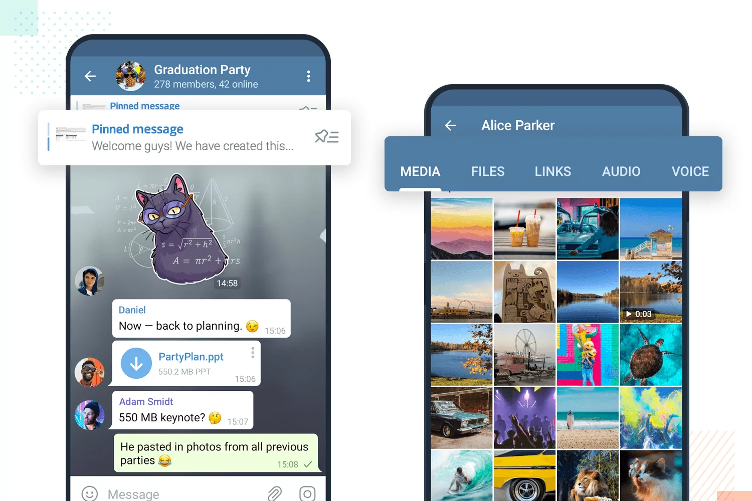
The Telegram design team’s focus on user control extends beyond these two features. The app provides users with a range of customization options, from notification settings to chat backgrounds. Telegram’s design allows users to tailor their experience to their preferences, which contributes to a more enjoyable and personalized experience.
19. H&M: example of great navigation in UX
H&M’s website offers a great example of how to handle a large amount of content with exceptional navigation design. The fashion store has a wide variety of items, which creates a need for an organized and intuitive user experience to connect them all.
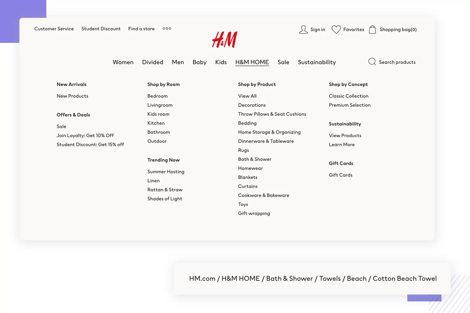
One of H&M’s standout features is its mega menu. The menu is huge and opens up to display in almost every corner of the store. It’s a great example of information architecture and labeling, allowing users to easily find what they’re looking for. The mega menu keeps everything organized, which makes it easy for users to navigate the site without feeling overwhelmed.
Another notable feature is H&M’s breadcrumb navigation. The breadcrumb navigation offers a way for users to jump around categories and levels within the store, without being too eye-catching. It’s designed to help users see where they are on the site and to help them find their way to where they want to go. This works as a wonderful secondary form of navigation that makes it easy for users to explore and find what they’re looking for.
Overall, H&M’s website is a great example of how a large amount of content can be managed with excellent navigation design. The mega menu and breadcrumb navigation are two examples of how the design team at H&M has created an intuitive and user-friendly experience for its customers.
20. Amazon Kindle: accessible UX design example
Amazon Kindle has revolutionized the ebook industry with its vast collection of books, magazines, and newspapers. Given the diverse range of users, Amazon invested in making Kindle an accessible product through its UX design. One way they achieved this is by using their assistive technology, VoiceOver, which helps users navigate and read Kindle content.
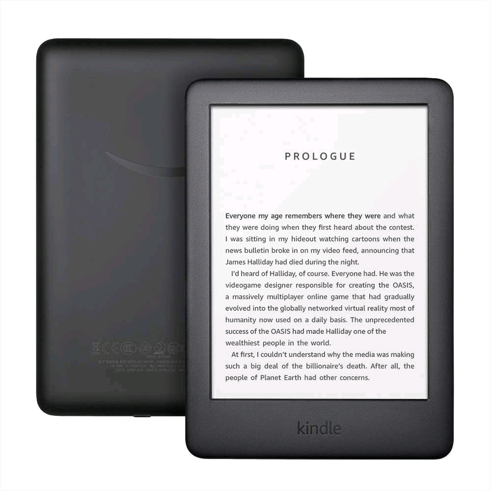
Moreover, Kindle has a range of settings that are specifically designed to make reading comfortable for users with moderate visual impairments. The product design also includes features such as a reading ruler, which helps guide users’ eyes, and various font options that cater to different reading preferences.
In addition to the accessible features, Kindle has a user-friendly interface that makes the overall experience seamless. Users can quickly navigate between books, adjust settings, and highlight text without any hassle. Overall, Amazon Kindle serves as an excellent example of how UX design can cater to a diverse range of users while still maintaining a seamless user experience.
21. Trello: example of letting users do what they want
Trello’s design philosophy is centered around letting users do what they want. The app and web app provides complete control over tasks and workflows, making it an exceptional example of UX design that caters to the user’s needs.
Trello stands out from the competition by allowing users to customize and personalize their boards to fit their unique workflows. The boards can be adapted to match different team structures and priorities, making it easy for users to collaborate and track progress toward their goals. This level of customization provides users with a sense of ownership over their work and enhances their overall productivity.
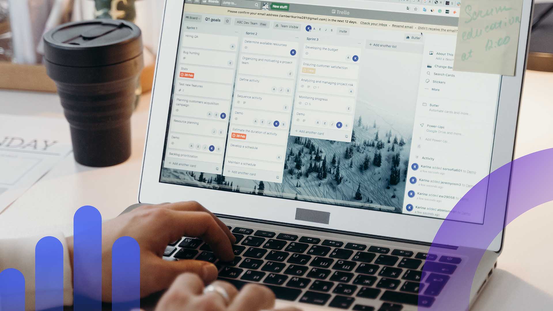
Trello lets users control who has access to what information, with various user permissions that can be set for team members. This helps ensure that confidential information remains secure and that only authorized individuals have access to it.
Overall, Trello’s exceptional UX design provides users with complete control over their work and is a great example of how user control can enhance the user experience.
22. Tripadvisor: example of refined searches
Tripadvisor is a popular travel website that has set the bar high when it comes to refined search options. The platform understands that travelers have specific requirements for their preferred stay, ranging from necessities like the number of guests to more nuanced details like breakfast or pool preferences.
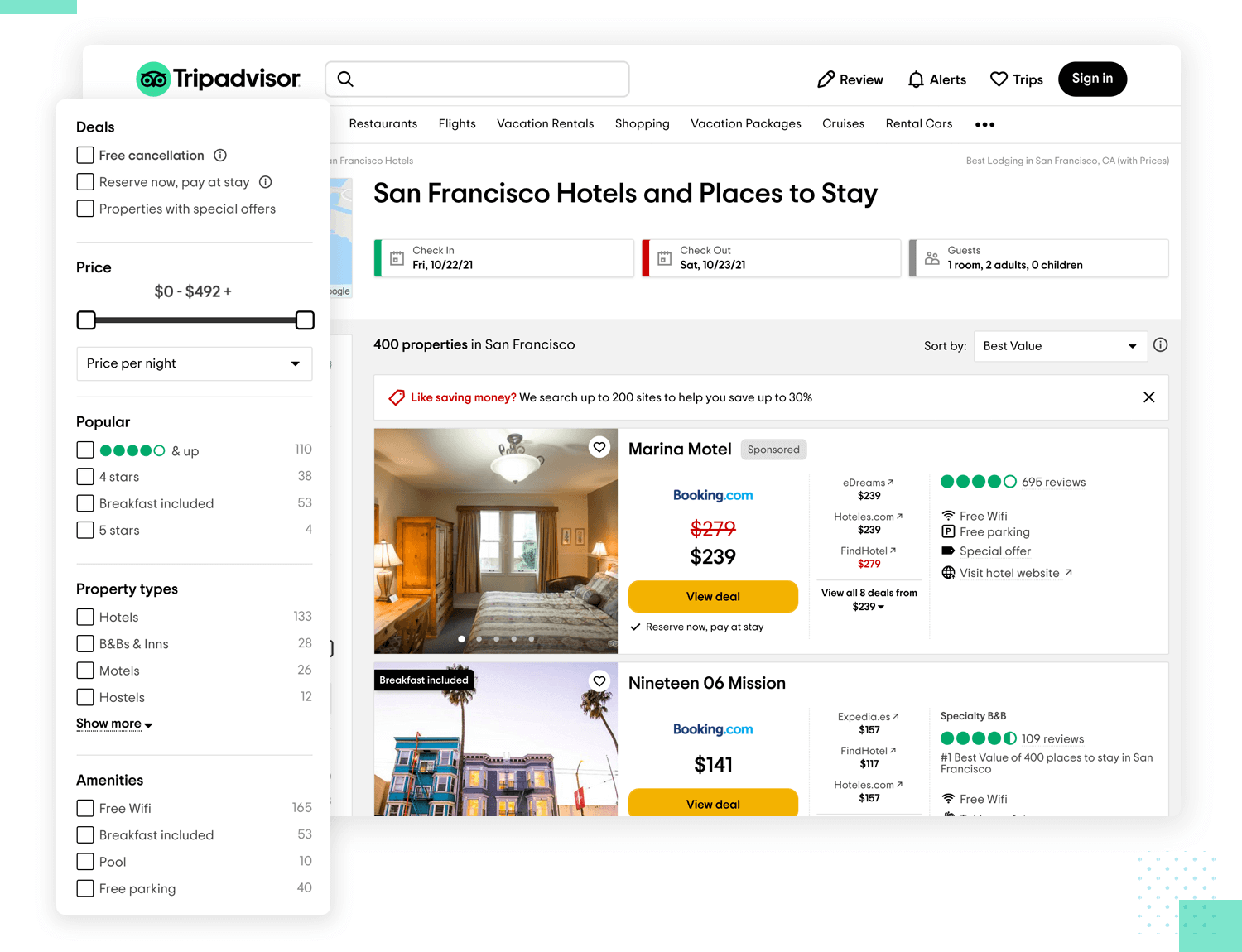
Trip advisor caters to all of these requirements, making it a great example of UX design that allows users to customize their searches to perfection.
The website’s vertical system is the highlight of its refined search functionality. Users can add all the preferences they could think of, and the website presents the results that match the criteria. The UI elements employed by Trip advisor are appropriately chosen and communicate the search options clearly to the users. The website has a style selection option that enables users to choose the style of the hotel they want to stay in or the area they wish to explore.
The design of Trip advisor’s search feature ensures that users don’t feel overwhelmed with a barrage of irrelevant options, while also ensuring that they have enough control over their search.
This user control is the essence of Trip advisor’s refined search feature and makes it stand out from its competitors in the online travel industry.
23. Starbucks: Making it Personal
Starbucks’ mobile app is a great example of personalization in UX design. The app utilizes users’ purchase histories and patterns to offer a customized experience for online ordering.
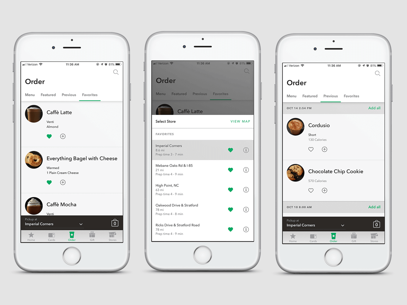
By understanding that humans are creatures of habit, the app presents users with their frequently ordered items through the “Recents” tab, making it easier to place orders. This feature eliminates the need to sort through the full menu, making the ordering process more efficient.
Starbucks has also incorporated a “Featured” tab to highlight new items, providing a personalized touch to the user experience. The app’s ability to remember users’ preferences and predict what they are likely to want allows for a seamless and personalized ordering process.
Compared to other food ordering apps, such as the Panera app, which requires users to sort through the full menu every time, Starbucks’ app stands out for its user-centric approach. While both apps have a “favorites” list feature, it requires an extra step and may not be a complete list of what the user is likely to want. Starbucks’ mobile app is an excellent example of personalization in UX design, creating a tailored experience that prioritizes the user’s needs and preferences.
24. Paypal: Letting Simplicity Rule
PayPal’s website redesign in 2014 marked the start of the company’s commitment to simplicity in UX design. Before the redesign, PayPal’s website was complex and challenging to navigate. However, since the redesign, the company has simplified the user experience on both its website and mobile app.
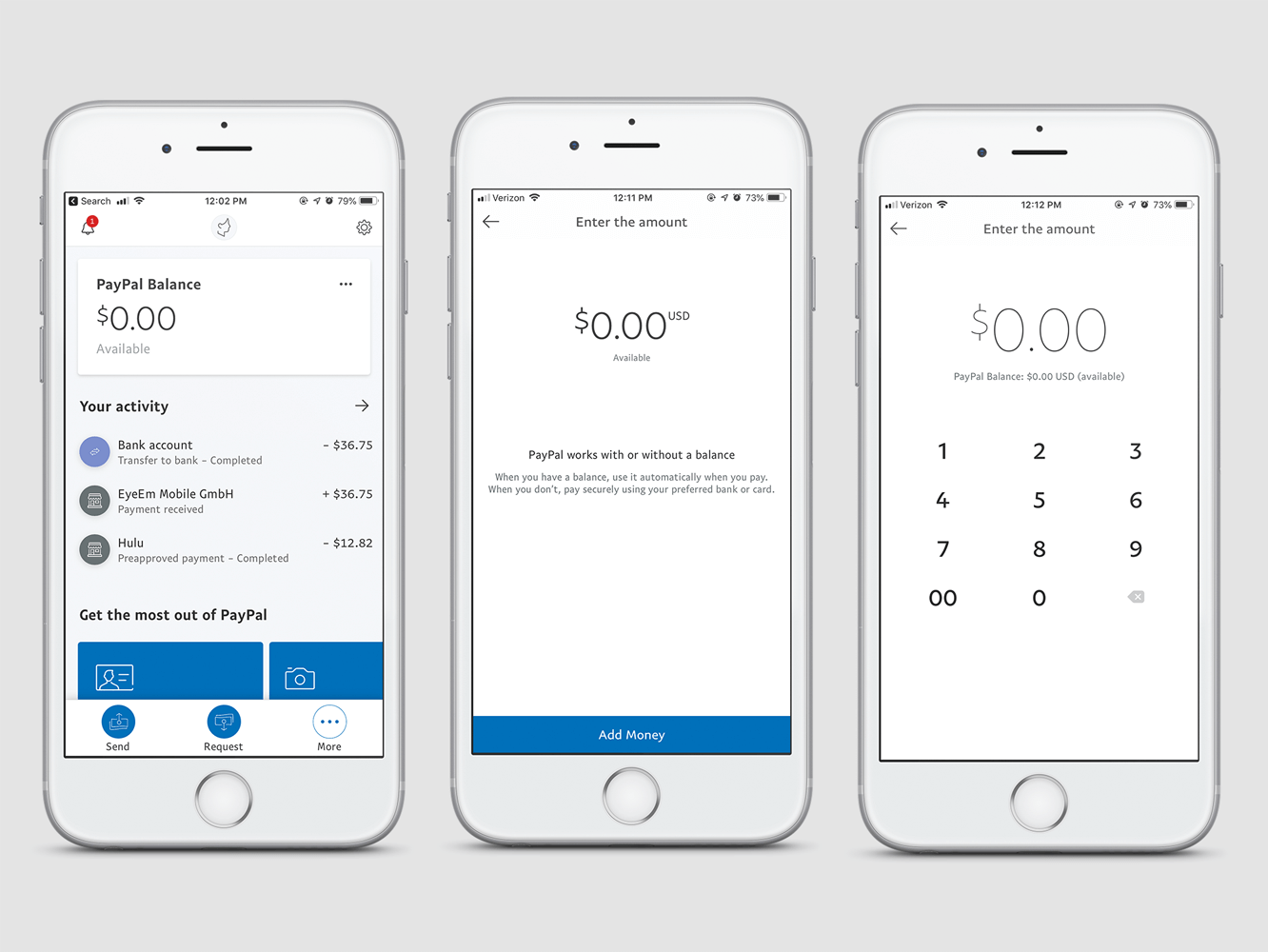
PayPal’s designers have employed several of John Maeda’s Laws of Simplicity to guide their efforts. For instance, they have reduced the number of clicks required to complete tasks, organized information logically and intuitively, positioned essential elements where users expect them, created context around features and functionality, added meaning to elements to make them more understandable, and saved users time whenever possible.
The result is a clean and straightforward interface that lets users quickly and easily perform tasks such as sending and receiving money, paying bills, and managing their accounts. Overall, PayPal’s focus on simplicity has paid off in the form of increased user engagement and customer satisfaction.
Growth with UX
In conclusion, UX design is a powerful tool for building engaging and user-friendly experiences. By following best practices and paying attention to the needs of both users and business owners, you can create experiences that are easy to use, fluent, and enjoyable.
It’s also worth remembering that user experience isn’t just about making an app or website look good—it’s about understanding how people use it. By walking in their virtual shoes, you can gain insightful feedback on how the product should be designed and develop ways to improve upon it. Whether for business success or simply for aesthetic appeal, make sure you get your UX examples just right!
Looking to enhance your user’s online experience and boost your website’s engagement and conversion rates? At The Brand Shop, our team of experienced designers can help you create a website that looks great and is intuitive and easy to navigate, making it a pleasure for users to visit.
Contact us today to learn more and take the first step toward improving your website’s user experience.
